Category: Design System

A Design System is a combination of different functional & reusable components, elements, and patterns. These are for website, web, or mobile app development. Here, you’ll find a wide range of blogs regarding Design Systems.

  • Best Vuejs UI Libraries

    Best Vuejs UI Libraries

    When developing any Vue-based user interface, using VueJS UI Frameworks will make it easier for you to work faster. VueJS UI Frameworks contain a ton of UI elements & components. And there are various VueJS UI frameworks available on the internet. To make it easier for you to choose the Vue UI Framework you need most, we have come up with 14 of the best VueJS UI Framework you must check out in 2022.

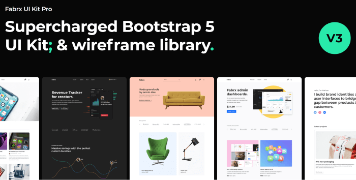
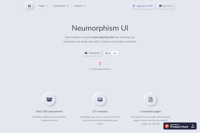
    We have a Vue3 freebie for you. Try it out! 👌🥳

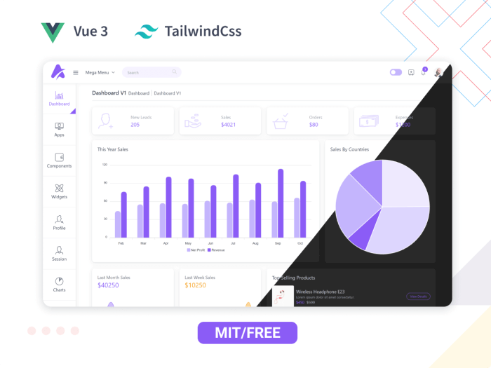
    Live Preview Details / Download

    So, without further ado! Let us jump straight into the listicle and find the best suitable ones for your next project.

    Best VueJS UI Framework

    Note: The list you are about to find out below is in no particular order.

    1. Vuetify – VueJS UI Framework

    Vuetify - Vuejs UI Framework

    Vuetify is a well-known Vue UI Component Framework. It is based on Google’s Material Design, a popular design language. Cards, shapes, interactions, depth effects (lights and shadows), and other UI components are available in the framework.

    It can assist you in creating professional websites and application front-ends. You will not need any design experience to accomplish this. It will be simple to create web pages with all of the pre-made elements and components. Moreover, with Google product standards such as Gmail and Google Analytics.

    More Info

    2. Quasar – VueJS UI Framework

    Quaser - Vuejs UI Frameworks

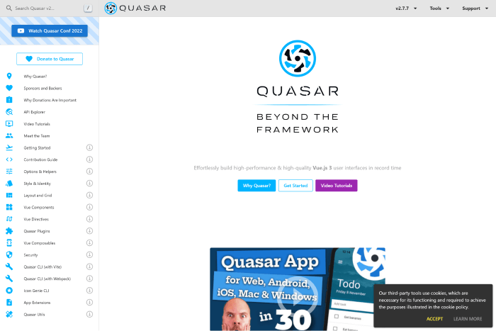
    Quaser is a Vuejs framework for creating Vue-based user interfaces that focuses on performance. Despite this, the framework appears to be based on Material Design. However, You can customize its components and elements to match your design system. The Composables can inform you more about the Quasar API.

    The framework has a strong GitHub community and is active on Discord and Twitter. So, without much concern, you can dive into the framework and create any Vue app for web, mobile, or desktop.

    More Info

    3. Element Plus

    Element Plus - Vuejs UI Frameworks

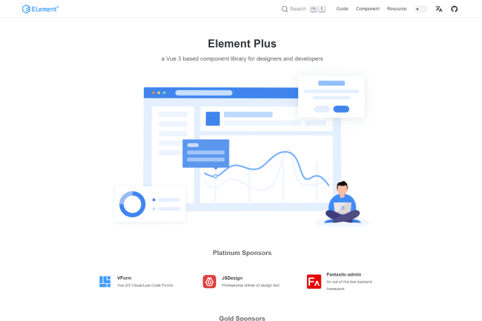
    Element Plus is a Vue 3 UI framework with an extensive range of UI components. You can use Element Plus to create complex applications. It also provides date & time pickers, timelines, calendar elements, trees, etc. It offers easy animations and a framework-wide globalization system. And, it regularly gets updated as well.

    So, if you need to stay up to date with instant updates, this can be your go-to option. Besides, it is great with problem handling, high customizability through SCSS variables, and pluggable elements.
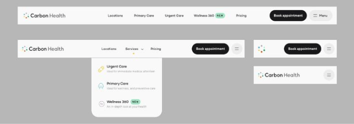
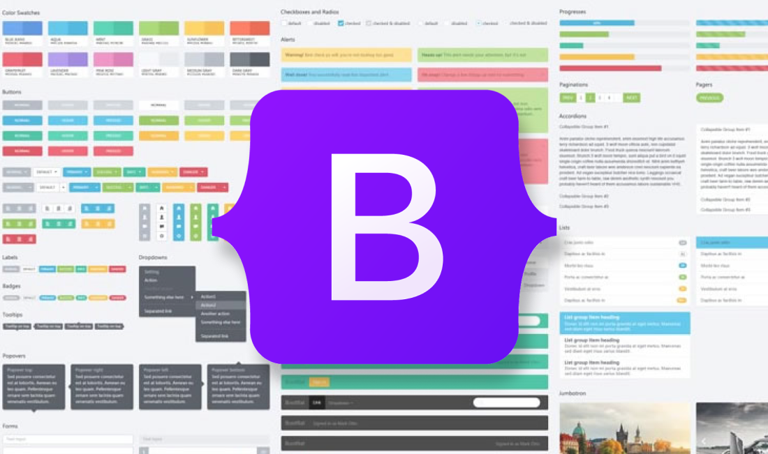
    More Info

    4. Bootstrap Vue

    Bootstrap Vue

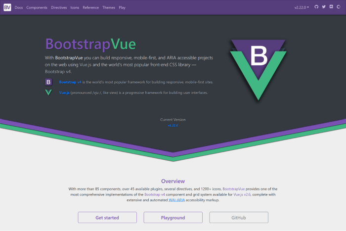
    Bootstrap Vue – A CSS library built using Bootstrap and Vue. You can use this library to create ARIA-compliant, mobile-first, and responsive web projects. The framework is simple to set up and understand. And it speeds up the development of your front-end applications.

    It has active community support on GitHub, and it will make you feel comfortable creating various UIs with it. There you will find numerous components, directives, icons, accessible plugins, and a lot more. Make sure to check out.

    More Info

    5. Fish UI – VueJS UI Framework

    Fish UI Vuejs UI Frameworks

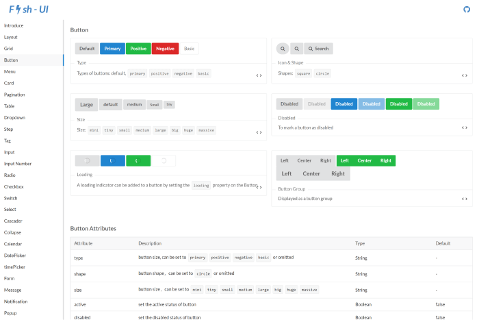
    Another excellent front-end web app using the Vue UI framework! The Fish UI framework is compatible with current browser environments and supports ES2015 and Webpack 2.0. It has very little to no documentation in this China-based library. However, its community is bustling enough to address all problems.

    The framework offers checkboxes, buttons, radio buttons, tags, backtops, dropdown menus, tables, pagination, cards, and more semantic CSS elements.

    GitHub More Info

    6. Buefy

    Buefy

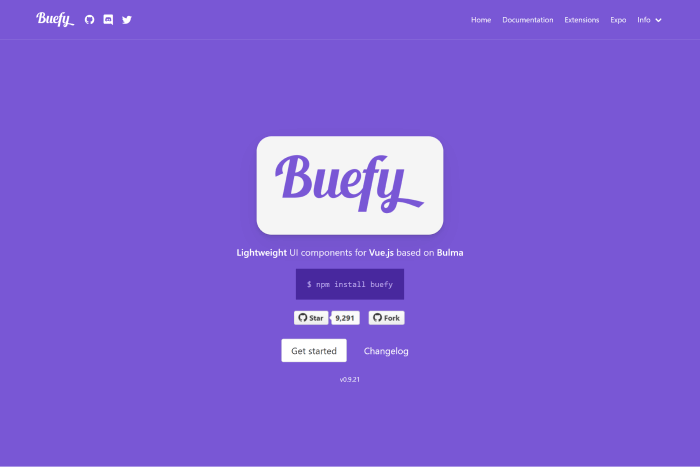
    Are familiar with Bulma? If you are, the framework called Buefy might be a good choice for you. This UI framework combines Bulma and Vue.js and helps you create beautiful applications with minimal code. Buefy is a highly customizable UI framework. Therefore, you can change its appearance, colors, sizing, and a lot more to match your requirements.

    For personalizing global variables that will be used throughout the entire program, Buefy uses Sass. This makes it a wonderful option for highly interactive online apps, as does the ability to incorporate dynamic elements like progress bars and sortable tables.

    More Info GitHub

    7. Vue Material

    Vue Material

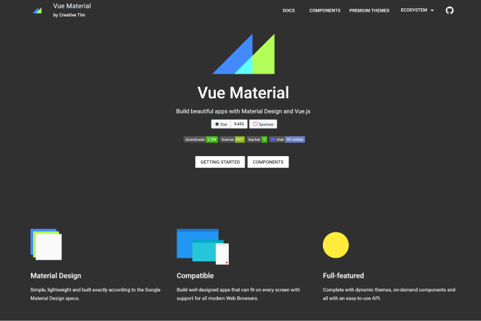
    Vue Material is a lightweight framework with Material Design. It is not as opinionated as other frameworks, although it adheres to the specifications of the letter. To create applications without the drawback of having to alter the library’s default styles, you must therefore make fewer design decisions.

    It offers better adaptability, portability, and simplicity of setup. With the framework,  you can start constructing right away because the framework has an advanced SPA boilerplate template based on Webpack. If you’re searching for reliability, portability, and simplicity with a framework, go for the Vue Material framework.

    More Info GitHub

    8. Vue Material Kit

    Vue Material Kit

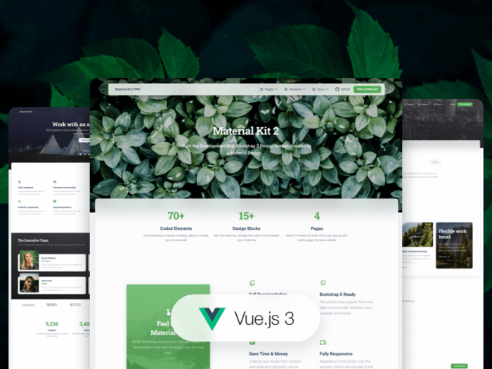
    Another framework that complies with the Material Design requirements is Vue Material Kit. Given that it is one of the newest in this group, its lack of widespread use is understandable. Because it is built on Material Package, a famous UI kit for converting Bootstrap 4, and 5 dashboards into slick-looking Material Design pages, we think it will gain better popularity. Your Vue work can move forward more quickly with the help of this UI kit’s many pre-defined pages and components!

    More Info

    9. PrimeVue

    Prime Vue - Vuejs UI Frameworks

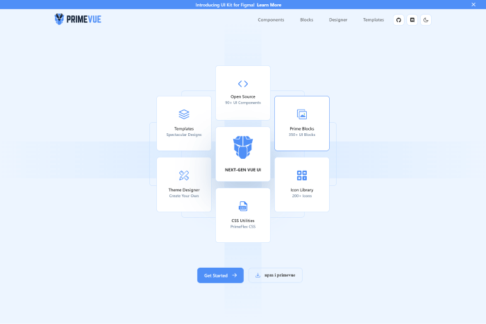
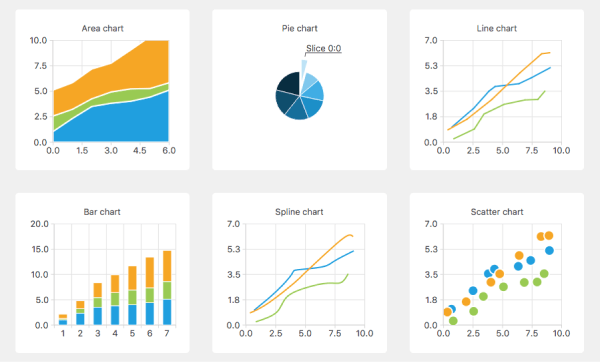
    PrimeVue is an excellent example of a framework for creating complex, modern, and highly dynamic Vue applications. It includes components, ranging from tables and paginators to well-designed graph-based organization charts, that you can use for building interactive Vue applications.

    Because its components are for designing complex software applications, you can also use it to create user interfaces for enterprise software. It also explains why Fortune 500 companies such as Airbus, Ford, Intel, and others rely on the PrimeVue component library.

    More Info GitHub

    10. Equal – VueJS UI Framework

    Equal

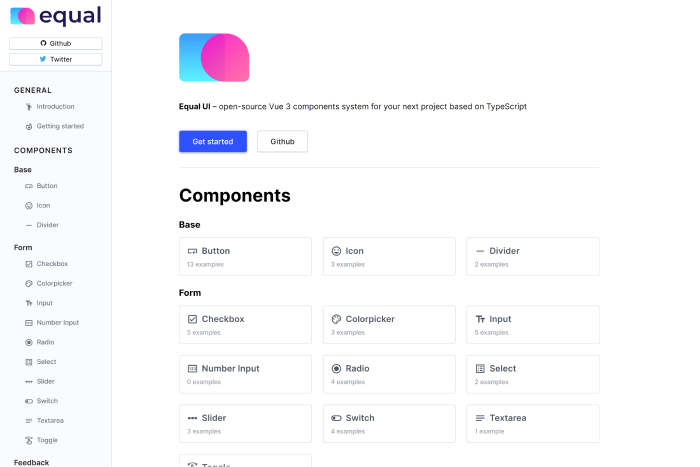
    Equal – A TypeScript Vue 3 UI component framework. It has a high capacity due to its simple documentation website and attractive components. Right now, it only offers an opinionated style that is more difficult to personalize than the other frameworks on our list. However, it has a great set of components that provides best-in-class Typography with superb performance and excellent animations.

    GitHub More Info

    11. Ionic Vue

    Ionic Vue - Vuejs UI Frameworks

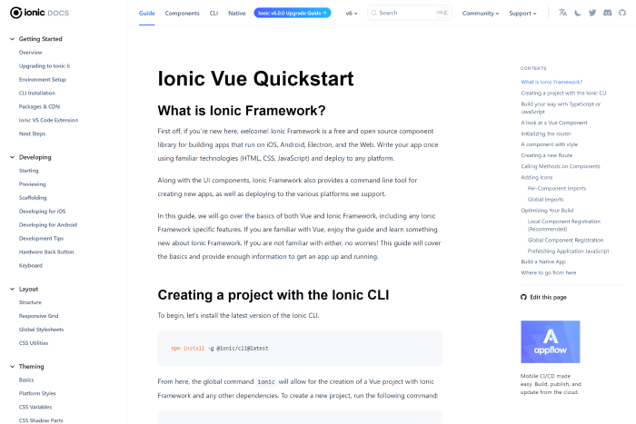
    Ionic Vue focuses on the user experience for mobile devices. A large Slack channel with basic members, a wonderful community, enterprise support, and a lot of StackOverflow queries are all features of this beautiful framework.

    So you can utilize it whenever you require assistance. It is used by many large corporations because they the UI frameworks properly.

    More Info GitHub

    12. Vuesax

    Vuesax

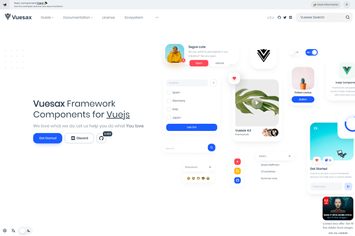
    The Vuesax UI framework always ensures a project’s front-end development is reliable and efficient. It offers a variety of adaptable components that you can quickly apply to the project and customize to your needs.

    The apps stand out from the competition thanks to the front end and the independent styling of components. The structure helps with brand marketing. It was made using a variety of frameworks, including JavaScript, Vue.js, TypeScript, Babel, and SASS.

    More Info GitHub

    Keen UI

    keen UI

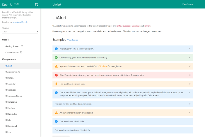
    Keen UI – A Popular Vue framework with Material Design. It has well-written interactive elements that would otherwise need JavaScript to function. Because it lacks styling, you may easily integrate the framework with your current style or a free CSS framework.

    If you want a lightweight Material Design implementation without the added weight, give it a try.

    More Info GitHub

    VueTailwind

    VueTailwind

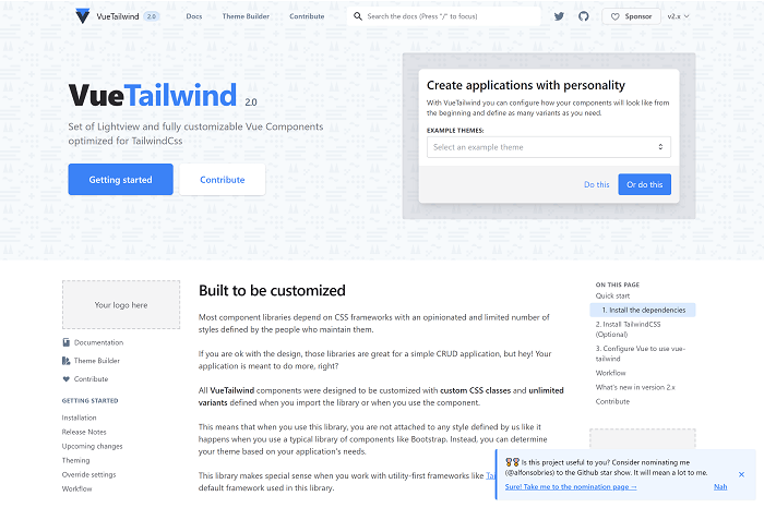
    An emerging front-end library called VueTailwind is built on the well-liked Tailwind CSS framework. Even while it’s still in development and might not be completely suitable for production-grade apps, it can be helpful if you’re working on a tiny Vue project and want to use Tailwind. Even though Tailwind CSS doesn’t often include pre-designed components, the VueTailwind component library does.

    VueTailwind creates these components using Tailwind’s utility classes. The majority of these elements were extracted from the Tailwind CSS documentation’s example code.

    More Info GitHub

    Similar Articles

  • 20 Macro-Level UI Design Terminologies for UI/UX Designers

    20 Macro-Level UI Design Terminologies for UI/UX Designers

    Since the modern computer first launched, user interface design has evolved into a language of its own. So, here, we’ve gathered the 20 most common Macro-Level UI Design Terminologies for you. These UI design terminologies will assist you in staying updated with the latest design terms. Also, you’ll have better communication with your peers.

    Octavia – Figma Dashboard & Design System

    octavia design system and dashboard

    Live Preview Buy Now

    Macro-Level UI Design Terminologies

    1. Tab

    Tabs are a web design navigation element that allows users to easily access different areas of a site or different parts of a single page. They function similarly to tabbed dividers in a filing cabinet in that users can easily locate a page containing related content by clicking a tab.

    tab in ui design

    2. Tab Bar

    A Tab Bar is a navigation structure and the heart of your app’s functionality. It ensures users’ current location while providing a constant overview of all other pages or places. The tab bar organizes and allows navigation between related and at the same level of hierarchy groups of content. You can find the tab scroller and tab components in the tab bar.

    tab bar in ui design

    3. Dropdown

    The Dropdown design pattern displays a list of contents, navigation points, and functions. It is also known as a dropdown menu. It includes both the menu and its submenus. And from there, you can select a value from this series of options.

    dropdown

    4. Card

    A flexible-size container that organizes information and has the appearance of a playing card is called a Card. The card in UI designs has numerous benefits, but one of the most significant is how simple it is to recreate them in distinctive ways that will show a website’s personality.

    card in ui design

    There are four kinds of cards that appear the most frequently among the many card types while examining the most popular and successful ones. These are Pins, Flat Design, Masonry, and Magazine Style.

    5. To-do or To-do List App

    A To-do or To-do list App is an application for maintaining day-to-day tasks or listing work plans. You can ensure all your future tasks by making a To-do list. It records the tasks in one place. So, you don’t have to forget anything important for you to keep in mind.

    to-do or to-do list app

    6. Table

    In UI design, a Table is for better visualizing data. It is to quickly scan, compare, sort, and filter the data to take their actions. In other words, tables are form elements that use columns and rows to display different interface information or data in a grid.

    table in ui design

    7. Pagination

    The term Pagination is the process of splitting a pile of content. It divides a section of content from a web or app into different pages. In other words, pagination is a pattern in UI that separates tons of content into different pages. For example, at the bottom of a blog page, you can see a row of numbers (pagination) if there are a large number of blogs.

    pagination

    8. Progress Bar

    A Progress Bar is a graphical control element. It is for showing the progress of a computer operation. Download, file transfer, and installation are some examples of a progress bar. Also, it includes a textual representation with a visual of the progress in a percent format. In other words, a progress bar shows visual data and ensures that the app is progressing.

    progress bar

    9. Navigation

    A set of user interface controls provides Navigation for a website or product. Its purpose is to allow users to form a mental model of the structures that designers create. Users can easily navigate and rely on them. It is a UI layer with a set of controls that appears on top of the information architecture

    navigation in ui design

    10. Components

    A Component is any part of your application that you can group logically and also think of as a single element. These are ideally reusable as a building block for the rest of the application. A component may contain other components within. However, each “component” is a separate entity.

    components in ui design

    11. Charts

    In UI design, Charts are visual representations of large amounts of data and the relationships between different parts of the data. They are more readable and understandable than raw data. There are various charts, such as bar charts, pie charts, line charts, column charts, bubble charts, and so on.

    chart examples

    12. Breadcrumb

    Breadcrumbs are a collection of links that represent the current page as well as its parent, grandparent page, and so on. It usually redirects to the site’s homepage. In other words, breadcrumbs are a secondary navigation aid that helps users quickly understand the relationship between their current location on a page and higher-level pages.

    examples of breadcrumbs

    13. Carousel Slider

    Carousel Slider is a photo and video slideshow on websites. It slides in motion, allowing users to navigate media files without wasting time or space. Although the carousel and slider have the same functionality, they have different approaches. A simple slider, for example, only shows one slide at a time, whereas a carousel shows multiple slides at once and highlights the media file you’re hovering over.

    Example of a Carousel Slider:

    carousel

    Example of a Simple Slider:

    slider

    However, there is another type of Slider in UI design that enables users to increase or decrease the value or range from a fixed set of options. Here is an example.

    slider component

    14. Chatbot

    A Chatbot is a program in UI for interacting with users. It allows users to ask questions and interact using natural language (text, graphical elements, or voice messages). Chatbot provides real-time answers or solutions when a user wants to learn more about a business or ask a question.

    chatbot

    15. Filtering

    Filtering is a set of controls in user interface design. It allows you to select values to shortlist and specify your choice. There are a lot of different filter types and applying them depends on the purpose you’re using them for.

    filtering

    16. Comments

    Comments increase both authors’ & users’ interactivity. If a product, video, audio, or text file (e.g. blogs) has a comments section, readers or viewers can share their thoughts on that particular subject or item.

    comments

    17. Accordion

    An Accordion in UI/UX design is a menu displaying a list of headers on top of one another. These headers reveal or hide content while clicking on them. You can navigate websites and pages using accordions. They can group links to assist users in navigating interfaces. These are especially useful in mobile design. It is because an accordion allows you to divide information into sections or pages. For example, most of the sites that have FAQs section come in accordion style.

    accordion

    18. Dialogs

    Dialogs are a combination of text and controls in UI design that inform users about various tasks and want you to take action, select, cancelation, or confirmation based on their requirements. When a dialog appears, it disables the rest of the app’s functionality and remains on the screen until you confirm, dismiss, or take action. Therefore, as a designer, you should only use dialogs when necessary.

    dialog

    19. Snackbars & Toasts

    Snackbars are UI elements that notify the user of an action that an app has performed or will perform in the future. They might have a text action but no icons. Snackbars do not interfere with the user’s activity or experience. Toasts, on the other hand (Android only), are primarily for simple feedback or system messages. They disappear after a timeout and cannot be swiped away.

    snackbar and toast in ui design

    20. Metrics

    Metrics are indicators of whether or not your UX strategy is effective. It tracks changes over time benchmarks against previous iterations of your site or app, and can also display data from your competitors, compare, and help you set different goals.

    example of metrics

    Wrapping Up

    Your search for Macro-Level UI Design Terminologies appears to have ended. However, these are not the only terms you will encounter while learning or practicing UI/UX Design. There are additional UI or UX design terminologies at the micro and macro levels.

    Working as a UI/UX designer and learning the terms is akin to learning a new language. However, we believe that as you continue to learn more about UI and UX design, your vocabulary will grow. Use this term listicle for definitions and to quickly find the answer to a question until you become a UI/UX design expert.

    We have gifts for you! Two awesome collections of Free & Premium Figma Dashboards, UI Kits & Design systems. Check out! 👇🥳

    Similar Blogs

  • 30+ Micro-Level UI Design Terms for UI/UX Designers

    30+ Micro-Level UI Design Terms for UI/UX Designers

    The vast industry of UI/UX design and development employs experts from many different backgrounds. While we learn the concepts best by doing the job. However, it is also very helpful to have references (beforehand) that compile key terms and definitions, so that we can easily clear any doubts. Therefore, this comprehensive list of 30+ Micro-Level UI Design Terms will help you understand the key technical terms. And, if you have a clear understanding of these terms, they will pillow your thought process in starting a design session, conversation, or in writing documentation.

    A mentor teaching ui design terms to a beginner ui/ux designer

    Micro-Level UI Design Terms

    1. Color Palette

    Color Palette for UI designers specifically refers to a combination of colors for designing a User Interface.  A color palette is a collection of colors or a visual foundation for your interface that has been chosen by the designer. It primarily represents the color formations of a brand.

    What is a color palatte - ui design terms

    Also, it assists you in maintaining consistency throughout the design and bringing the brand’s aesthetics. This makes it easier for a designer to create visually appealing, pleasing, and enjoyable user experiences.

    2. Color Code

    Color Code primarily displays information about various colors in a way that a computer can understand and display. These are commonly used in UI design for websites and software applications. These come in various formats.

    color code in ui design term explained

    Currently, modern browsers support 24-bit color (full spectrum). And,  guess what! There are over 10.6 million different color combinations available. Some of the most common color code types for UI designers are Hex, RGB, HSL, HSB, and CSS.

    3. Typography

    Typography in UI design refers to the art of assembling typefaces on an interface. Its goal is to make all copies meaningful to the audience, accessible, readable, legible, and scalable. In other words, typography makes it easier to understand information inside an interface. It enables users to realize how the product or service benefits them.

    example of typography

    If the typography is appealing, it will help pique the user’s interest and increase the interface’s conversion rate. As a UI designer, you must understand typographic trends and approaches. Different typographic styles convey a variety of meanings. And, when it comes to UI design, it is best to keep things simple and clean.

    4. Heading

    Headings are names, titles, various terms, subdivisions, etc. The primary goal of headings is to “improve a page’s usability by making it more scannable.” Users typically scroll down the page looking for relevant keywords to further understand the topic step by step.

    In this case, headings divide a page into sections to make a user’s scanning process faster and easier. Headings are also important for search engines to scan and understand the topic and figure out its relevance to the interface. In six sizes, headings are available: From H1 to H6. The H1 heading size is the highest and most important level of heading.

    5. Body Height

    body height in typography

    The Body Height in digital typography is the measurement from the top of the highest letterform to the bottom of the smallest.

    6. Paragraph

    paragraph in ui design

    The most fundamental unit of language that conveys meaning is the Paragraph. Though paragraphs are the core units of text content, designers frequently only specify the font face and size.

    7. Form

    Forms are a combination of inputs, selects, and text areas. Users who want to submit information fill out forms. One common example is when you order something online and fill out the form with different types of details like your address, quantity, etc. this is called a form.

    form in ui design

    The auto-filling feature in the form now made it easier for users to fill a form. Below we are going to describe to you what are inputs, selects, and text areas in short.

    8. Input Fields

    input fields in ui design

    Users can enter various responses using Input Fields, which are crucial components of UI design. They come in a variety of contexts. However, most people have used them while providing personal information and shipping addresses on e-commerce website forms or while submitting online inquiries.

    9. Selection

    selection in ui design

    Selection is a group of elements on which user operations will be performed in UI design. Although the computer may make a choice automatically, the user often adds items to the list manually.

    10. Textarea

    textarea

    Textarea allows the user to enter and edit long text data displayed in multiple lines. The Text Area has a drag indicator that allows the user to resize the area horizontally and vertically.

    11. Icons

    icons - ui design terms

    Icons in UI design are pictograms or ideograms that are used in web or mobile interfaces to support usability and the successful flow of human-computer interaction.

    These are an essential part of creating a visually appealing design, but they can also significantly improve the usability of a website or other digital product.

    12. Buttons

    buttons

    Buttons represent actions that users can take. They are typically placed throughout your website’s user interface, and they should be easily found and identifiable, as well as indicate the activities they allow a user to complete.

    13. Button Groups

    button groups

    Button Groups are to create toolbars or split buttons for more complex components. These are also useful in UI for acting as mini “tabs,” such as switching between date ranges.

    14. Badges

    badges in ui design

    In user interface (UI) design, the term Badge refers to a particular symbol that highlights an interface element. Using badge notification is displayed. A badge adds more details to the component it is tied to.

    15. Chips

    chips in ui design

    Chips in UI design are little elements that represent an input, an attribute, or an action.

    16. Tags

    tags - ui design term definition

    Tags enable users to quickly identify important information about items by organizing and categorizing them. They use keywords to visually label items with small amounts of information or the item’s status.

    17. Avatar

    Avatar in ui design

    An Avatar is a common UI element that represents users’ identities on the interface. You can see Avatars in business apps, social networks, and games. Even though it is a small object, it has amazing usability & importance: Avatars help people to connect in a more friendly way.

    18. Rating

    Rating - UI Design term

    A Rating reflects a user’s interest in the content. Rating systems enable users to highlight the value or benefit of specific content and improve content quality over time in a continuous feedback loop. You can apply this characteristic to products with personalized attributes or without them.

    19. Effects

    effects in ui design

    The term Effects in design refers to shadows, elevations, and blurs. When we use a shadow, elevation, or blur in a UI component or element, we call it an effect.

    20. Drop Shadow

    drop shadow example

    The term Drop Shadow is a shadow beneath an object. An object can be anything like an element, component, text, or image. When the color of the object and the background are too similar, a drop shadow can help to make it more visible and appealing. However, drop shadows must only be employed sparingly.

    An amateur designer usually doesn’t know how to balance a drop shadow beneath objects. Also, in some cases, they put drop shadows even in irrelevant places.

    21. Elevation

    elevation example

    The Elevation is the z-axis distance or relative depth between two surfaces. The elevation of an element tells us how far apart the surfaces are and how deep the shadow is when measured from the front of one surface to the other.

    22. Blur

    blur effect in ui design

    The term Blur refers to a visual effect when text or image edges appear fuzzy or out of focus. So, blurring is the process of making something less clear or distinct. In the context of image analysis, this could be interpreted broadly – anything that reduces or distorts the detail of an image could apply.

    23. Toggle Switch & Toggle Button

    toggle switch vs toggle button
    Image Source: UX movement

    Toggles are user interface control with two mutually exclusive states: ON and OFF or Return and One Way. Designers frequently confuse toggle switches and toggle buttons because they both manage states, but there is a significant difference. Toggle switches represent system states, while toggle buttons represent contextual states.

    24. Tooltip

    tooltip

    A Tooltip is a popular GUI element. It appears when we hover over an object. Its purpose is to display brief information about that element or component with a text box. An example would be a button’s description that explains what it is about, what an acronym stands for, and similar information.

    25. Checkbox

    checkbox in ui design

    Checkboxes are little square boxes on a user interface. There are two possible states, one is checked and the other one is known as unchecked. The checkmark will appear in the square when it is checked. Utilizing checkboxes, the user is given a variety of options from which to choose as many as necessary to finish their work.

    26. Radio Button

    radio button

    On the screen, the Radio Button appears as a little circle. Also, there are two button states, and when you select a button, a solid dot fills the circle. Unlike checkbox groups, radio button groups function as a single control and only allow the user to select one option from the available range.

    27. Grid

    types of grid in ui design

    Grid is a system for arranging layout when creating a responsive interface in UI design. The screen layouts are for websites, mobile apps, or other user interfaces. There are many grid types, and each one has a specific function.

    By using rows and columns, the grid system helps in aligning page items. This column layout is used by designers to consistently place text, graphics, and functionalities throughout the design. Every component has a specific location we can easily recognize and duplicate elsewhere.

    28. Gutter

    gutter in grid

    The area between columns is known as Gutters. It helps in dividing content. At each breakpoint range, gutter widths are constant values. Gutter widths might vary at various breakpoints to suit a specific screen size. 

    29. Column Grid

    This is the most common type of grid used by UI Designers. The term Column Grid involves taking a page and splitting it into several vertical fields, to which objects are then aligned. To make a complete page designers use column grids extensively.

    30. Padding

    padding

    The spaces between UI elements are Paddings. Padding is an alternative spacing method to keylines. And you can measure it in 8dp or 4dp increments. You can measure padding both vertically and horizontally. To do that it does not have to span the entire height of a layout.

    31. Margin

    Margins are the spaces of a design that lies between the border and the element. These are all the empty spaces around the border and in between and other elements. A margin surrounds all four sides of the content, which you can change for each side.

    32. Baseline Grid

    For vertical spacing, a Baseline Grid is an excellent typographic tool. It can also be used to arrange other page elements. To put it another way, it aligns all of your text to a vertical grid, similar to lined papers.

    Are These The End Of All Basic UI Design Terms?

    It looks like your search for all micro-level UI design terms has ended. However, these are not the only terms that you’ll come across while learning or doing UI Design. There are more UI design terms both in terms of micro and macro levels. But these are the most common small UI design terms that designers always feel confused about at the beginning.

    To work as a UI/UX designer and learn the terminology is similar to learning a new language. But, we believe as you will keep learning more about UI and UX design, your vocabulary will improve rapidly. Until you become a design expert, use this term listicle for definitions and quickly find the answer to a question.

    Octavia – Figma Dashboard & Design System

    octavia - figma design system and dashboard

    Live Preview Buy Now

    Similar Articles

  • 10 UI Design Principles You Must Not Forget As A UI/UX Designer

    10 UI Design Principles You Must Not Forget As A UI/UX Designer

    Are you familiar with the core principles of UI design? Think again! Here, we will discuss the 10 UI design principles you must not forget as a UI designer. Learn how you can become the person who never fails to bring out the best in every UI design project.

    UI Design Principles
    UI Design Principles

    User Interface is also known as UI. It is one of the core points in any software development project. The main goal of a UI designer is to create a well-balanced interface that satisfies the need of the user. To achieve that, one needs to study the patterns of human behavior and how they interact. Only then do designers ensure if the interface is performing correctly or not. Without further delay, let us learn these principles of UI design.

    10 UI Design Principles for UI/UX Designer

    The principles you are about to find out below apply to any Graphical User Interface (GUI) design.

    1. Simplicity in UI Design

    The first rule of UI Design is to create a design that will satisfy the users. Although designing a UI is enjoyable, it is always harder to keep it simple. As a designer, you must always consider the user’s point of view. Keep in mind who you are designing for and why.

    A good UI design is defined solely by how easily users understand how the program works. It is not about glitzy decorations, self-indulgent or formal designs. It is all about the usability of a UI. Otherwise, the final output only shows unnecessary components or leaves out elements. These occurrences divert the user’s attention away from the core & relative components.

    To achieve simplicity, you must first sort out all the absolute essentials. Remove all unnecessary items from your list. Remember that if the UI only shows how creative you are and not what your client requires, you should remove it right away.

    Free Figma Dashboard & Design System

    2. Speculate and Prevent

    If you want to apply the rule of Simplicity, first, you need to understand what is relevant to the user. Your go-to task will be to make sure you fully their wish & needs. After knowing what is suitable, you can easily speculate what your user will want to have/do next.

    Now you are going in the user’s way. Therefore, it will be easy to provide them with the accurate tools, resources, and information they need. However, if you want to direct them in another direction, you can take action by changing an earlier part of the design. It will guide your users in your desired direction from the outset.

    3. Driving Seat for Your User

    It makes no difference whether they are actually in their control or whether you are driving them in a specific direction. While navigating a User Interface, a user must feel totally in control. The UI should blend seamlessly into the background while remaining where your user expects it to be. However, you must ensure that your interface does not appear to be forcing them to perform a specific action—i.e. making decisions for them.

    4. Methodical Approach and Consistency

    A basic concept of UI design is mastering consistency. One has to make sure that his/her design is consistent. It needs to be consistent across the platform and also with industry standards employed elsewhere. Usually, a great UI doesn’t reinvent, it improves where necessary. Designing a UI is not about uniqueness, it’s about what’s most widely understood.

    In terms of introducing something new or something that functions differently, you need to differentiate between what went before and what you’re trying to begin. A trick is to apply inconsistency deliberately to less valuable features. The Novel features will easily stand out as a result of this. Inconsistency on purpose differs from sloppy or erratic designs.

    5. Avoid Unnecessary Complexity

    Overlays such as Modal Windows or Bottom Sheets help you avoid the unnecessary complexity in UI Design. Always aim for the least number of steps and screens possible. Discover all of the industry’s best practices. Moreover, organize information logically, liberated, and self-retained. Another good practice is to entirely group tasks and subtasks together. One should not hide subtasks on pages where no one would think to look for them. Create a clear and logical classification for screens and their content.

    Users dislike the painstaking process of clicking too many times to complete a task. Therefore, always keep the number to a bare minimum, such as one or two. Another UI design principle is known as the Three Click Rule. According to this rule, users should be able to perform any action or access any information they require by clicking no more than three times from anywhere within the app.

    6. Distinctive Signposts

    While navigating through your app/web app a user should not feel confused. It is not even compromisable for first-time users. Your user should always find your interface interesting, easy and fun to navigate through. So, a UI designer’s job is to set intuitive layouts and make clear labels of information.

    One has to make sure that the page architecture is simple & logical. Also, make they are well-marked. A user should feel comfortable and clearly see whether they are moving through the software. And, if they want to go anywhere else, they must have the freedom to move out as they wish. Do not trick & push them into a place where they don’t wish to be. Provide distinctive visual cues, wherever possible/needed.

    7. Be Tolerant of Mistakes

    Users who are unfamiliar with your app might not have known exactly what to do or where to start. Therefore, don’t blame users for making a mistake or being unsure. Implement a swift and forgiving undo/redo tool to make it simple for people to travel back in time. It not only prevents the aggravation of lost data and lost time but also inspires users to explore your software and make changes without worrying about the consequences.

    8. Frequent Feedback

    It is mandatory to inform and acknowledge users about their progress and actions (complete or incomplete). Set the design in the format that it should be while the user is navigating. Provide important forms of feedback on the major proceedings or actions. Also, for smaller and more frequent actions, smaller forms of acknowledgment should be used. Besides this, ensure that the status information is always easily accessible and accurate.

    Error occurrence is a common thing on websites. But remember, when they do, a user should know about the error that occurred in a clear manner. There should be an easy-to-understand message reading “error code,” or a “404 page” should appear. Make sure to describe the problem or inform them what they need to do to fix this.

    9. Functions In UI Design

    If you fail to create a clear & concise hierarchy, it won’t be possible to create a truly minimal and streamlined UI. As we’ve already mentioned about

    Failure to create a clear hierarchy is one of the most common obstacles stopping people from designing a truly minimal and streamlined UI.

    Although, when it comes to user experience, every item is essential. But, some pieces are more critical than others. To reflect this hierarchy in the design, encourage/highlight users to do/follow X/Y first, followed by Z. Make them more visible in front of Z. This could be as simple as changing the size of buttons, text, or other elements.

    10. UI Design for Accessibility

    Apps are used by people from all walks of life. Though you can’t make a website or app run abiding everyone’s individual choice. Still, you can put options like multiple languages, color setting options, light-dark theme, RLT, or LTR to meet their basic requirements and to generate actions on pages. Always design with questions in mind, not with answers.

    Summary

    A good UI design produces a frictionless environment where users may thrive, but the design completely vanishes from view. You can feel it, but you can not see it. It is similar to how we don’t notice the air we breathe until it becomes contaminated or until we run out of it.

    Great designers know that adhering to basic UI design principles like those discussed above can contribute to a better user interface. It enables interaction to the point where the user hardly notices the UI. Use these ten UI design principles in your UI Design projects and see how effective UI design can be.

    The best designers know that following simple UI design principles such as those we’ve looked at above can help to create a more effective user interface, facilitating interaction to such a degree that the user barely notices the UI at all. Apply these 10 UI design principles to your next project and discover for yourself just how powerful successful UI design can be. 

    Blog Suggestions

    https://ui-lib.com/downloads/bazar-pro-react-nextjs-ecommerce-template/

  • Top 10 Free Figma Wireframe Kits for Web/App Designers in 2022

    Top 10 Free Figma Wireframe Kits for Web/App Designers in 2022

    Are you a beginner web or app designer looking for some useful Free Figma Wireframe Kits to help you complete your work more quickly and smoothly? Don’t look any further! We’ve hand-picked some of the best Free Wireframe Kits for Figma-based Web/APP Designers. But first, please explain what a wireframe is.

    What is a Wireframe Kit?

    A wireframe is referred to as the skeleton of a website or app. We create a basic layout of a website or app before we begin developing it. It must be straightforward in its approach because it will direct the user’s journey flow on this website or application. It’s more of a solution for our web or app development projects.

    As a result, when you use a ready-made wireframe, you will find it much easier to give your ideas shape. A form from which you can begin your development journey. Simple elements such as headlines, copy, body, CTAs, photos, and so on are included in a wireframe.

    Now, without further ado, let’s get into the meat of the matter. The list that follows is not in any particular order. So, make an informed decision and view the live demos before downloading them. However, because they are all free, you don’t have to worry about downloading and working with multiple Wireframes at the same time.

    1. Figma Wireframe Kit (Free)

    Figma Wireframe Kit (Free)

    This Figma wireframe kit contains a plethora of UI elements, sections, and components for quick prototyping. These low-fidelity wireframing templates are intended for brainstorming and planning your designs. This kit is here to help you save time during your creative process if you want to speed up your wireframing in Figma.

    To build your layouts, use a Bootstrap grid and premade, editable components to create fast, modern, responsive prototypes. You’ll save hundreds of hours while delighting your customers. Templates are included, and you may use them in your projects without restriction!

    Link

    2. Wireframe Kit

    Wireframe Kit

    This wireframe kit will help you speed up your workflow. This kit is for you if you’re at an early stage of your project and want to sketch out a quick rough idea of what goes where without getting into the nitty-gritty polished details. Complete with components for frequently used items, UI controls, and browser windows, as well as styles that are simple to update.

    Link

    3. Ironhack Wireframe Kit

    Ironhack Wireframe Kit

    Ironhack is a great Figma Wireframe Kit for you to start as a UI/UX designer. There are a good amount of useful bits and pieces, interface components, and UI elements. It will help you quickly convey ideas and create a design. And lastly, test them. So, have a great journey with Ironhack.

    Link

    4. Contra

    contra wireframe kit

    Contra is a starter wireframe kit for prototyping and designing your idea quickly. It has over 150 components and 50 ready-to-use mobile screens in its library. With the help of its style guide, you can easily create new components and screens.

    Link

    5. Simple Wireframe Kit

    SImple wireframe kit

    Because sometimes all you need are some boxes, buttons, and form elements, that is the reason this simple Wireframe Kit is here. Use the light and dark boxes to arrange your content. No specifics are permitted! To change the appearance of your wireframe, use color styles. It now also employs variants and auto layout.

    Link

    6. Mobile Wireframe UI Kit

    mobile wireframe kit

    The mobile wireframe kit is a collection of commonly used system components that can be used to quickly mock up your mobile (phone) ideas before investing in the full design. Before you build, use it to share ideas, iterate, prototype, and gain buy-in.

    For more info and updates check out the description from the button below.

    Link

    7. VanillaFrame

    Vanillaframe

    VanillaFrame is a straightforward kit for creating wireframes. To begin designing, I tried to only include the most essential elements. It contains 9 Color Styles, Icons by “Feather Icons” (Only the essentials), Placeholder Images, Square Images, Circular Images, avatars, and more are all included. Text styles, button styles, and inputs are also available.

    Link

    8. Wirefigma

    Wirefigma

    Design websites and applications more quickly so you can focus on what matters most: your ideas. They made a few changes recently. It has the following features: 1. Supports auto layout. 2. Text styles and 3. Variants They also added new components to it, giving it a completely new look.

    Link

    9. Mobile wireframing kit

    wireframing kit

    A straightforward kit that includes only what you need to create clear wireframes. All common components are included, with a platform-agnostic design that keeps the focus on your structure.

    Link

    10. Sketchy Wireframes

    sketchy

    A simple toolkit for creating mockups of apps and websites. Allow yourself to be free of pixel perfection and quickly mock up your ideas with this kit. Create anything by assembling your components from the provided primitives (lines and rectangles).

    Link

    Wrapping Up

    Finally, we’d like to point out that each of these Figma wireframe kits has its own set of advantages and disadvantages. You can’t say things like “this is the best Wireframe kit” or “that is the best Wireframe kit.” Simply put, you should download everything you require. Each one serves a different purpose and is useful in different circumstances. As a result, make certain to find the ideal match for your project’s requirements. Thank you for taking the time to read this.

    You Might Also Like This Free Product from UI-LIb

  • Top 10+ Best Free Figma UI Kits for Web App Designers in 2023

    Top 10+ Best Free Figma UI Kits for Web App Designers in 2023

    If you’re a web app designer looking for free Figma UI Kits then you’re absolutely on the right page. In this blog, we will be looking at the top 10 best free Figma UI Kits for web designers in 2023.

    Free Figma UI Kits for Web App

    Figma is an amazing web-based interface design tool for web designers. Recently, more and more people from the industry have shifted towards Figma from other design tools. The reason why Figma is so popular now is that this design tool not only made web design easier. But also, you can collaborate and share interactive prototypes for your projects.

    Let us learn a little about ‘What is a UI Kit?’ before diving into the collection of the best Figma UI Kits for 2023.

    What is a UI Kit?

    A user interface kit aka UI Kit is a collection of files that includes essential user interface elements such as fonts, layered design files, icons, documentation, and HTML/CSS files. UI kits can be as simple as a few buttons and design elements or as complex as toggles that change fonts, colors, and shapes in real-time.

    Top 10 Best Free Figma UI Kits

    Now, without further delay let’s jump straight into the realm of Figma UI Kits. Let’s find out which unique ones can bolster your web app development projects.

    Uko – Free Figma Dashboards & Design System

    uko dashboard and design system ui kits

    Uko is a mega-collection of useful UI Kits that includes dashboards. It was downloaded over 100 times in a single day on the first day of release. It’s a design system with a plethora of features, pre-built pages, and highly customizable components.

    As a result, creating a web app or an admin dashboard will be a breeze. You can create your desired product with almost no effort. Auto layout, component-based, smart-scalable typography system, and many other features are included in the design system.

    The design system includes over 5 dashboards, 8+ application pages, over 150 pre-made components, 50+ pre-built widgets, 20+ charts, and more. So, don’t forget to look into Uko. Don’t forget to give it an upvote on Producthunt, if you find it useful.

    Demo / Download

    Strapi – Free Figma UI Kit

    Strapi - Free Figma UI Kit

    Strapi UI Kit is a design library. It is a library of components that can easily make your web app making project smoother and faster. These pre-built components are very useful and essential. Also, the UI Kit is very well-organized.

    It offers everything that you are looking for to design your user interface. It includes a large set of colors, sub-navigation, icons of different purposes, a responsive grid, and a lot more. Make sure to check out Strapi.

    Demo / Download

    Moja UI – FREE Top UI Kit & Design System

    Moja UI

    Moja UI is a user-friendly and robust UI library and design system that will help you power up your designs. It is free and will remain so in perpetuity, regardless of what it grows into. This simple UI kit & Design System contains over 8500 components & variants, 1000+ function icons with size variants ready, 258 flag icons with 2 size variants, popular brand 200+ logos and 500+ icons, responsive typography, and a lot more.

    Also, it offers an auto layout and has a slim and adequate set of color styles to get you started on your UI project quickly.

    Demo / Download

    Tableau – Free Figma UI Kit

    Tableau - Free Figma UI Kit

    Tableau is a free Figma UI Kit that can help you prototype Tableau Dashboards using Figma. It will lead you in the right direction through every obstacle that you face with guidelines, color combination, typography, etc. This product contains everything from dashboard example pages to charts, icons, tooltips, tables, footers, and more.

    Most importantly, along with all the essential UI components, you’ll get a ‘how to video’ for helping you to take full advantage of this UI Kit. So, without delay, experience Tableau Figma UI Kit for free and make your work hours peaceful.

    Demo / Download

    Design Components – Free Figma UI Kit

    Design Components - Free Figma UI Kit

    NativeBase is a Figma component library with modular and accessible components for designing and building React and React Native applications. This UI Kit includes a large number of typographic and color styles. Auto Layout also powers dynamic layers. It has a lot of themeable components and responsive designs that work on a variety of platforms. Last but not least, it comes in both light and dark modes.

    Most Importantly, all of the components are open source and can be used in production-ready React and React Native apps.

    Demo / Download

    Building Blox – Free Figma UI Kit

    Building Blox - UI Kit

    Blox was created as a personal project to gain a better understanding of best practices for building a system of styles and nested components in Figma. The UI Kit contains necessary typographies, color system, spacings, elevation, fluid grids, etc.

    It has icons and other important UI components such as buttons, pagination, selection, sliders, tooltip progress bar, and everything else that you need inside a UI Kit.

    You can check out Blox from the button below and easily duplicate it into your Figma design tool.

    Demo / Download

    Creatt UI Wireframe Kit – Modern & Clean Design Wireframe

    Creatt UI Wireframe Kit - Modern & Clean Design Wireframe

    Creatt UI Wireframe Kit is one of the largest free Figma WireFrame Kit with all the essential components. The product offers 500+ blocks, predesigned pages, auto layout, icons, brand color variations, and whatnot!

    Creatt Wire makes designing landing pages easier with over 17 different categories and 500+ frames. The possibilities for what you can make are limitless. It has stackable frames and a modern design. A Design Kit that will not let you or your clients down. This Framework is designed to support websites that use the 1120 Grid.

    So, they carefully selected some of the best Blocks and converted them into frames that are as clean as they are modern. This brief description is not enough, you must go and have a look at Creatt by yourself.

    Demo / Download

    Untitled UI (FREE Version) – Figma UI Kit

    Untitled UI

    Untitled UI is the largest Figma UI Kit and Design System in the industry. With the help of Untitled UI, you can level up your skills and also save thousands of your working time. This way is bigger than any UI Kit and Design system with over 350 global styles with smart, scalable typography system, useful, and accessible color system.

    Moreover, there are 10,000+ components and variants available which are beautifully crafted with a full Auto layout 3.0 and smart variants. Also, it offers you 420+ ready-to-go desktop and mobile page examples.

    Demo / Download

    Inertia – UI Kit

    Inertia

    Inertia is a powerful Figma UI Web Design System template. This template was created to teach you how a real prototype of a web page works. Though you can have free access to this product using it for personal or commercial benefit is not allowed. It has a color palette, typographies, grids, footer sections, and more.

    This is completely a product for scaling up your web app design-based skills.

    Demo / Download

    Bulma – CSS UI Kit v1.05

    Bulma

    Bluma is a CSS UI Kit that has recently been updated to version 1.05. It includes all of the necessary assets, such as icons, color palettes, buttons, typography, components, grids, input, pagination, text area, navbar, and much more, as does any large design system or UI Kit.

    The new version included a few minor fixes, such as fixed color styles, added button states, minor component fixes, and so on.

    Demo / Download

    Trim – Task Management Web App UI Kit

    Trim Task Management Web App

    Trim is a web app UI kit for task management that allows you to easily create and monetize all of your work. It has over 210 pages. And with an unlimited number of projects and collaborators, this product gives you complete control over your team. Trim allows you to easily organize teamwork, manage to-dos and tasks, assign projects to clients and staff, and track workflow progress. Trim has proven to be an effective and powerful task management web app for new businesses.

    You can easily access your team’s daily, monthly, and weekly work reports from this page. This Design file is easily customizable. Your users will appreciate your site because it provides a unique user experience (UX), as well as a clean, modern, and beautiful design. Layered and organized, responsive resize, global color and text styles, and with a free Google Fonts font family (Inter).

    Demo / Download

    Similar Blogs From UI-Lib

    1. Free Figma Design Systems for UI/UX Designers
    2. Best Free Figma Icon Library for Web & App Developers
    3. Figma Plugins For Web & App Designers
    4. Tailwind CSS UI Kits and Components (Free)
    5. Top Free & Premium Bootstrap UI Kits
  • Top 20 Best Free & Premium Bootstrap UI Kits for 2022

    Top 20 Best Free & Premium Bootstrap UI Kits for 2022

    Are you a developer looking for the best Bootstrap UI kits? They are right here! In this blog, we have carefully selected the 20 free & premium Bootstrap UI Kits. These UI Kits can be a great option, to begin with, your project and 2022.

    top bootstrap ui kits

    According to a report from 2018, there are more than 18 million websites that have Bootstrap as their CSS framework. And after its popularity, there came several UI Kits for Bootstrap and it’s still growing. So, what are UI Kits? They are pre-built sets of components such as fonts, layered icons, documentation, and more for making web/app development faster.

    Thus, we’re going to present you with some of the best available Bootstrap UI Kits for web and app development. The list is in no particular order.

    1. Webpixels – Stylish UI Kit & Components

    Webpixels - Stylish UI Kit & Components

    With Webpixels web development is much more fun because you don’t have to worry about the design. With this Bootstrap 5 component library, you can create a wide range of beautiful websites that adhere to sound design principles. These front-end solutions are used by thousands of developers.

    Here, you’ll find a lot of reusable components, 1400+ icons, and Figma assets for designers. Make sure to check out both free & premium components in Webpixels from the button below.

    Demo / Download

    2. Dash-UI – Bootstrap 5 Admin Dashboard & UI Component

    Dash-UI - Bootstrap 5 Admin Dashboard & UI Component

    Dash UI is a free-of-cost Bootstrap 5 & HTML5 admin template with a large amount of UI Components. If you want to create a backend application or an admin dashboard with Bootstrap 5, try Dash-UI. It is a responsive, browser-compatible package.

    Moreover, the template is supported by specialists. Specialists who provide rapid and effective support. In the component section, you’ll find border suggestions, colors, texts, typography, ratio, stacks, and a lot more.

    Demo / Download

    3. Snacked – Bootstrap 5 UI Kit & Admin Template

    Snacked - Bootstrap 5 UI Kit & Admin Template

    Snacked is a well-responsive Bootstrap UI kit & admin template. For a browser-compatible, developer-friendly template you can give it try. Also, it has UI components with the most recent version of Bootstrap plugins.

    Moreover, there are different types of notifications & sweet alerts and dynamic & static widgets options. And guess what! The number of UI components they’ve gathered here is huge. For example, over 60 responsive HTML pages, more than 200 UI Icons, multiple charts & map options, 3 color dashboards, and a lot more.

    Demo / Download

    4. Fabrx UI Kit Pro

    Fabrx UI Kit Pro

    Fabrx UI Kit Pro is a supercharged Bootstrap 5 UI Kit & Wireframe Library. It has a lot of starter pages to get your creative juice going. Also, you’ll be amazed to know that there are more than 600 components. And, with a large amount of UI components, it has 20+ charts & tables, 500+ custom icons, 120+ light wireframes, 120+ dark wireframes, and a lot more. Experience Fabrx UI Kit Pro by clicking the button below.

    Demo / Download

    5. Ayro UI – Bootstrap UI Component Snippets

    Ayro UI - Bootstrap UI Component Snippets

    Ayro UI has both free and premium versions. Now, together they got downloaded over 17,000 times. It is a Bootstrap HTML5 UI Library, Snippets, Components, and Toolkit. You can quickly create responsive – landing pages, templates, or websites by copy-pasting blocks. Moreover, it is a collection of 300+ beautiful and essential UI components, snippets, blocks, pages, and templates. You can use it to build a complete site without coding or designing from scratch.

    Free Version Premium Version

    6. Core UI

    Core UI bootstrap ui kit

    CoreUI has a big name in the industry as a template and design system provider. Here, it offers a beautiful UI Kit that features multiple admin templates. And, it is filled with different charts, and graphs like sales, stats, social media, traffic, and so on. It is an open-source Angular & Bootstrap admin template with free access to updates, SCSS files, Chart.js, Pace, basic support, etc. And guess what! It supports other frameworks such as React and Vue too.

    So, make sure to check out CoreUI Bootstrap UI Kit. It also has a premium version available with more amazing features.

    Demo / Download Premium Version Github

    7. Soft UI Design System PRO – Premium Bootstrap 5 UI kit

    soft ui design system pro

    Soft UI is one of Creative Tim’s most complex and innovative Bootstrap 5 UI Kit. it is comprised of over 300 frontend individual elements, such as buttons, inputs, navbars, nav tabs, cards, and alerts, which you can freely select and combine. All components can have color variations, which you can easily change with SASS files and classes.

    Here you can find both the demo and pro versions of Soft UI. The premium version contains more than 300+ elements, 100+ design blocks, 4 plugins, 39 example pages, and a lot more.

    Demo / Download Free version

    8. Neumorphism UI

    Neumorphism UI bootstrap ui kit

    Neumorphism UI is a free user interface UI Kit with Bootstrap. However, it is a new and contentious design trend that has gained traction since the beginning of 2020. On Product Hunt, this Bootstrap UI Kit was ranked as the fourth-best product of the day. It includes over 200 individual Neumorphic components as well as five example pages.

    Demo / Download

    9. Now UI Kit

    Now UI Kit Bootstrap UI Kit

    Now UI Kit is grooving around the marketplace for more than 3 years now. Creative Tim is the creator of this Free Bootstrap 4 Design UI Kit. Inspired by material design, the template offers more than 50 elements. Not only that but there are also 3 templates available on this UI Kit.

    To have it in PSD or Sketch format, you have to visit Invision. The UI components come in bold colors, beautiful typography, spacious arrangement, and more.

    Demo / Download Premium Version

    10. Argon

    argon boostrap 4 design system

    Argon is unquestionably one of the best Bootstrap UI Kits available today. Beautiful components and a handful of pages and sections are the ideal starting point for your project. The kit’s design is perfect, combining simplicity and style. The UI Kit is also from Creative Tim. And, it is offering 100 individual components, three plugins, four example pages, and a lot more.

    Most importantly, it gives you the freedom to mix and match. All components can have color variations. That you can easily change with SASS files.

    Demo / Download Premium Version

    11. Pixel Bootstrap 5 UI Kit

    pixel Bootstrap 5 ui kit

    Pixel Bootstrap 5 UI Kit is another high-quality UI Kit with tons of components. It comes in a beautiful and clean style. One notable feature of Pixel is that it has a timeline component added to it. Also, it has no jQuery dependency & 3 example pages. Don’t forget to experience this UI Kit from the button below. It also has a Pro version available with lots of new features.

    Demo / Download Premium Version

    12. WrapKit Lite

    Wrapkit Lite

    WrapKit Lite is one great UI Kit that needs to be among the top three Bootstrap UI kits. What is different in this is that they have a few sections available that other UI kits do not provide. There are 17+ interface sections, over 11 amazing landing pages, and more than 25 Bootstrap 5 useful elements.

    Demo / Download Premium Version

    13. Material Kit 2

    Material kit 2

    Creative Material Kit Tim is also based on Google’s infamous Material UI. Unlike MdBootstrap, this UI kit includes a couple of example pages that you can use as a starting point. The stunning purple colors are another feature that sets it apart.

    The template offers 60 front-end individual elements, two plugins, four example pages, and more. If you want more than this, then make sure to check out Material Kit Pro.

    Demo / Download Premium Version

    14. MD Bootstrap

    MD Bootstrap ui kit

    MD Bootstrap (MDB) is a Material Design for Bootstrap v4 & v5. They’ve integrated the components into the most popular JS frameworks, including Angular, React.js, Vue.js, and others. Although Material UI is on the decline, it is still worth considering for your next project.

    The template is offering 700+ UI components & templates. Also, the installation process is so simple that it will take only 1 minute to start your work. Most importantly, this is completely open-source and licensed under MIT.

    Demo / Download

    15. Shards UI Kit

    Shards UI Kit

    Shards is a stunning and minimalist Free Bootstrap UI Kit. What makes this kit stand out are the form error styles, calendar inputs, and sliders that most other kits lack. This is unquestionably a kit worth considering.

    This design system is based on Bootstrap 4 and has 10 extra custom components. Also, there are two pre-built landing pages. It’s also light, with a stylesheet that’s only 13kb minified and gzipped.

    Demo / Download

    16. Get Shit Done UI kit Pro

    Get Shit Done UI kit Pro

    Pro Get Shit Done Kit It’s a Bootstrap Kit with a plethora of customizable components. They are not only pixel-perfect and lightweight, but they are also simple to use and combine with other components.

    It includes a fantastic set of elements that are essential to any project. Everything you need to get your website up and running is right here, looking as good as ever. There are 8 pre-built pages, pixel-perfect icons, and a lot more. It also has a free version available.

    Demo / Download Free Version

    17. Paper Kit 2

    Paper Kit 2

    Paper Kit 2 is a free Bootstrap 4 UI Kit. It comes with soft colors, lovely typography, and thoughtful illustrations. There are 50 elements, 3 plugins, 3 example pages, etc. Also, it is a fully coded, well-documented UI Kit. A beautifully organized UI Kit that you can rely on.

    It also has a premium version available. Make sure to check that out too.

    Demo / Download Premium Version

    18. Landing

    Landing handcrafted free ui kit

    Landing is a free Bootstrap UI Kit with stunning features and well documentation. It comes with tons of hand-crafted components. These components can increase your web-creating speed. Also, it is available in Sketch and Photoshop files.

    There are 80+ components in the popular category and a useful icon set. This is a lightweight UI Kit offer.

    Demo / Download

    19. Miri UI Pro

    Miri UI Pro

    Miri UI is a Bootstrap UI Kit that has a lot of carefully crafted UI Kits with clean and unique designs. All the essential features are here for you. Most importantly, this pro version comes with a year full of premium support, lifetime free updates, and a 7-day money-back guarantee.

    Also, it has a free version available. Make sure to check that out.

    Demo / Download Free Version

    20. Figma Bootstrap 5 UI Kit

    Figma Free Bootstrap 5

    Figma Bootstrap 5 UI Kits is a Free Bootstrap UI Kit from themeselection.com. It has 300+ organized Bootstrap 5 components with an atomic design system and auto layout. With this, you can easily jump-start your project. Also, you can easily set up colors, typography, and border-radius in this UI Kit offer.

    Experience Figma Bootstrap 5 UI Kit from the button below.

    Demo / Download

    Wrapping Up

    Finally, it seems like your search for the best Bootstrap UI Kits has come to an end. Finding the best Bootstrap UI Kit is not that difficult as there are tons of Bootstrap available in the market. However, to find the one according to your requirements is always a hard one. So, we’ve gathered these reliable UI Kits. Most of them have a free and a premium version available. Thus, make your choice but always make sure to check out the documentation, live demos, and configuration. Thank you for reading the article.

    Suggested Articles

    If you’re interested in other Bootstrap-based products, make sure to check these out.

    Done! Open Source Design System

    Kalista – Free Bootstrap Business Template

    land Creative 404 Not Found Page template

    Jaximus Creative Bootstrap Coming Soon Template

  • 20+ Best Figma Plugins For Web & App Designers in 2022

    20+ Best Figma Plugins For Web & App Designers in 2022

    Are you looking for the best Figma Plugins that can help you as a web & app designer? Look no further! These are the most essential Figma Plugins that can save you hundreds of hours.

    Figma is a browser-based interface & design application. It can help you design, prototype, and generate code for your application. Besides Figma is now a leading design tool in the market because it has a lot of amazing features that support teams every step of the design process.

    One of the many advantages of Figma is that you can work online. Thus, working and collaborating in real-time is no big deal for Figma. Another great aspect of Figma is its sleek UI. Moreover, the addition of Figma plugins in Figma is a seamless plug-and-play.

    In this article, we will be looking at the 20+ best Figma plugins. With these plugins, your web & app design process will be smooth as butter.

    1. Unsplash – Free Figma Plugin

    Unsplash figma plugin

    Unsplash is among the most popular Figma plugins. It gives you an instant opportunity to import tons of images with one click. It is a stock-photos-based website with the Figma Plugin option. Besides, the website claims to have over 265,000 contributing photographers. And, it generates over 16 billion photo impressions per month from its growing library of over 3.2 million free photos.

    Demo / Install

    2. Material Design Icons

    Material Design Icons figma

    Material Design Icons was originally created by Grappex.com. With Material Design Icons’ massive collection of 27k new icons, you can have icons for various purposes and platforms. All of them are available in two formats, PNG and SVG. Search any icons by their name and you are going to find them. You can also filter them by different categories, sizes, and styles. There are multiple styles options for users such as filled, rounded, outlined, etc. And most importantly, it is free of cost, simple to use, and very quick.

    Demo / Install

    3. Lorem Ipsum

    Lorem Ipsum figma plugin

    You can fill your text layers with the ‘Lorem Ipsum’ Figma plugin, which is a dummy text. This is all auto-generated text layers. To do that, you just have to select the text layers and click generate and that’s all. It can generate text layers for each layer uniquely. This will automatically fill the selected layers with the right amount of ‘Lorem Ipsum text and fit into the existing frame.

    Demo / Install

    4. Content Reel

    Content Reel figma plugin

    Content Reel is a Figma plugin that allows you to collaborate with others. By dragging text strings, avatars, images, and icons from one palette, you can quickly design layouts. Importantly, you can create custom content and share it with other Figma users.

    Demo / Install

    5. Remove BG – Free Figma Plugin

    Remove BG figma plugin

    If you are using any images and you want to remove the background of the images, then Remove BG is the best plugin to remove the background with a single click.

    Remove BG is a tool for removing the backgrounds from images. It is one of the best plugins to remove the background with a single click. Besides the company is constantly trying to develop its work performance.

    Demo / Install

    6. Blob – Free Figma Plugin

    Blob figma plugin

    Create organic Blob shapes with the click of a button. Every shape that is generated is unique to the last. You can control how unique a shape is along with how many points it has.

    Making blob shapes for designs has never been so easy before Blob. It is a Figma plugin for creating unique blob shapes. Besides, you will have full control over the shape’s uniqueness and the number of its points. All the shapes are created using SVG.

    Demo / Install

    7. Feather Icons

    Feather Icons figma plugin

    Feather Icons is a basic icon library. The reason it is a great icon library is that it has all the important ones in it. In most cases, these are just enough for web & app design.

    Demo / Install

    8. Charts – Free Figma Plugin

    charts figma plugin

    Charts is another useful Figma Plugin that generates charts. These charts can be added and edited within your Figma doc. Every single chart has its configuration, like max and min values. You need to select a frame and select which chart to use the chart will be placed.

    Demo / Install

    9. Get Waves – Free Figma Plugin

    Get Waves

    Get Waves is a Figma plugin that generates Waves for free in SVG format. You can select a curve of your preference and choose its complexity and randomize.

    Demo / Install

    10. Chart

    Chart figma plugin

    Chart is another Figma plugin for creating popular charts. It can take any actual or random data to make a chart of your preference. The fun fact is that you can copy-paste the data from Excel, Google Sheets, Live connection with Google Sheets, remote JSON (REST API), local CSV, JSON files, or Numbers, and it works.

    There are 16 types of charts, generate random data with different trends, and update it any time.

    Demo / Install

    11. Stark – Free Figma Plugin

    Stark figma plugin

    Stark is a free Figma plugin that lets designers check readability contrast, simulate color blindness in real-time, and tweak their designs based on the results. It has proven particularly useful when creating color palettes for data visualization and checking readability contrast within files.

    Demo / Install

    12. Rename it – Free Figma Plugin

    Rename it figma plugin

    In a flash, give your layer and group folders meaningful names. You can rename your layers in order or add the width and height of the layers with Rename It.

    Demo / Install

    13. SkewDat – Free Figma Plugin

    SkewDat

    Every one of us wants to skew our objects on Figma. And yes, you can do it easily by using SkewDat Figma plugin. This plugin was designed by Unfold.co.There are options for live preview adjustment, skew multiple objects at once. Also, it has a very minimal interface and has the ‘revert back to original’ options open.

    Demo / Install

    14. Design System Organizer

    Design System Organizer

    Manage names with /’s type folders. Styles can be copied between files. Relink instances and styles in bulk to new masters with the same names. Learn more from the link below.

    Demo / Install

    15. Text from Image

    Text from Image

    To copy text from an image file, use OCR. Have you ever wished you could quickly extract text from a static image? Using the magic of optical character recognition, this plugin makes it simple.

    Know the problems, how it works, and install from the button below.

    Demo / Install

    16. Sort Layer

    Sort Layer figma plugin

    You can now easily sort layers by name or position using the Sort Layer Figma Plugin. Simply sort the selected layers by their X and position. And keep their relative staking order on the page.

    Demo / Install

    17. Autoflow – Free Figma Plugin

    Autoflow figma plugin

    Autoflow makes it simple to create flows. Select two objects, and there will be a line that appears between them magically. Run Autoflow, then select any two shapes while holding down SHIFT to draw a line. Finally, keep selecting until you’re completely wired!

    Demo / Install

    18. Batch Styler – Free Figma Plugin

    Batch Styler

    Change multiple text and color styles at the same time! If you need to change the values of multiple (text and color) styles at once but don’t want to change each text style individually. Then this is exactly what you need.

    It changes from inter to Roboto while keeping all font weights and other styles is now possible. Whether you have two or thirty text styles. Moreover, you can easily change colors that are all based on the same hue value: Batch Styler will update all styles accordingly.

    Demo / Install

    19. Dark Mode Magic – Free Figma Plugin

    Dark Mode Magic figma

    Change your design to Dark mode. Colors for Dark mode are generated automatically from a light palette and applied to elements by the Dark Mode Magic plugin. Simply select the frame and activate the plugin. That’s all there is to it!

    Demo / Install

    20. Figmoji – Free Figma Plugin

    Figmoji figma plugin

    Figmoji is an open-source emoji plugin for your design. Emojis can be seamlessly incorporated into your designs. Simply choose the emoji you want, and Figmoji will add the SVG of that emoji.

    Demo / Install

    21. LottieFiles

    LottieFiles figma plugin

    Lottie is free and easy to use once you’ve set it up. There is a setup process that you need to complete before you can begin. As an app developer/designer, you must need the Lottie library for Android, iOS, or React Native. It has access to 1000 free Lottie animations. You can drag and drop your dotLottie (.lottie) and Lottie JSON (.json) files on your Figma design board.

    Demo / Install

    22. Breakpoints – Free Figma Plugin

    Breakpoints figma plugin

    Breakpoints is free Figma plugin dedicated to previewing responsive layout inside a frame. The best thing about this plugin is that you can create & share the animation of your designs’ responsiveness with others through Breakpoints. Also, it even works without opening the plugin window. Moreover, anyone from your team can resize frames without installing it.

    Demo / Install

    23. LilGrid – Free Figma Plugin

    LilGrid

    This useful plugin will assist you in cleaning up the interface of your app. It organizes all of the different elements on your dashboard or app into a grid that you can then define yourself. It is ideal for organizing a large number of buttons and/or icons used in your design or system.

    Demo / Install

    Wrpping Up

    Finally, it seems like that our journey for the best Figma plugins for web & app designers has come to an end. In most cases, you’ll be needing all of these plugins downloaded on your Figma software. However, if you are already familiar with most of these plugins, then try the ones you didn’t use before. There are hundreds of plugins in Figma. So, finding out the useful ones is a time-consuming task.

    Therefore we’re recommending you go through some best lists of Figma plugins and download the useful ones. Thank you for reading this article.

    About Us

    We’re UI-Lib, a software development company that provides you high-quality free and premium templates, design systems, UI KIts, etc. We make you these products with the best technologies like React, Vue, Angular, and more. At present, we have 9500 sales on Themeforest.

    Visit our website for more top-quality products.

    UI-Lib

    Make sure to check out our Figma file included the eCommerce Template.

    Figma file (Preview Link)

    Details / Demo / Download: Bazar Pro – eCommerce Template

  • Top 20+ Best Free Figma Design Systems for UI/UX Designers in 2022

    Top 20+ Best Free Figma Design Systems for UI/UX Designers in 2022

    Are you a UI/UX designer/enthusiast looking for the best Figma Design Systems? Here they are. In this blog, we’ve handpicked some of the best free Figma Design Systems dedicatedly created for UI/UX designers. But first, let’s understand what is a design system.

    free figma design system

    Design has now become of the topmost priorities for everyone. Whether you are a designer/developer, or an app/website user. You are always looking for designs that can make your work easier. Also, you need a design that can make everything look interesting and easy. Thus, you need design systems for creating better designs because they have everything gathered in an organized manner.

    Design systems have grown to be an important component of what makes a company or product successful. Particularly in the hyper-competitive global software market. Historically, these companies have relied solely on user experience as a key differentiator.

    https://ui-lib.com/downloads/figtify-figma-uikits-and-design-system-for-vuetify/

    This demand for better experiences places enormous strain on designers all over the world. They are pushed to take on more projects and work faster while producing higher-quality results. If there is no standardized design language to draw from, this can cause issues.

    What is a Design System?

    A Design System is a coherently organized set of interconnected patterns and shared practices. Design systems aid in the design and development of digital products such as apps and websites. So, by downloading/duplicating a design system to your Figma software you can produce UI/UX designs for different software. Design systems will empower you and give you ideas about constructing a design. These are all organized in a manner that you don’t have to wander around and get a headache for thinking about innovative designs.

    20+ Best Figma design Systems for UI/UX Designers

    The design systems which got the most downloads from the Figma community and have high-quality features are listed in this article. As everything in the Figma Community is charge-free, you don’t have to worry about spending money. Here, you will find almost every design system from the Figma community that is worth mentioning. However, the list is in no particular order.

    1. Uko – Free Figma Dashboards & Design System

    Uko Free Figma Dashboards & Design System

    Uko is an exceptionally good free Figma design system with dashboards in it. After its release, just within a single day, it hit 100 sales. It is a design system with tons of useful features, pre-built pages, and highly customizable components. So, making a web app or an admin dashboard will be very easy for you. With almost no effort, you can build your desired product.

    The design system has features like auto layout, component-based, smart-scalable typography system, and a lot more. Most importantly, the design system contains more than 5 dashboards, 8+ application pages, over 150 pre-made components, 50+ pre-built widgets, 20+ charts, and more.

    So, make sure to check out Uko. And, if you find it useful, don’t forget to give it an upvote on Producthunt.

    Demo / Download

    2. iOS Design System — Free UI kit

    iOS design system

    Native iOS components and app templates are organized into a “Most Design System” that is fully compatible with Human Interface guidelines. It’s named, limited, and based on the experience of native iOS apps. This iOS design system is from Setproduct.

    This free UI Kit includes amazing styles, typography, templates, design system, and icons. Currently, it has over 1k react and more than 57k downloads.

    Demo / Duplicate

    3. Built-in Figma Design System

    Built-in Figma design

    This is an outstanding project idea from designer Rogie King. It contains minimal style components. The project is done while he was making a live stream of this design system. So, comparatively, it is less organized. However, it is a pretty good design system option with great components. At present, it has 2k love react and over 29k downloads.

    Demo / Duplicate

    4. Core Design System

    Core Design System

    Core Design System is a design package designed by Ryan Sael. It can supercharge your workflow. It is a design system UI kit for Sketch, Figma, AdobeXD, and Studio. Besides, it can fit into any project and keep visual consistency. No doubt, it will work faster. Now, it has over 300 love react and 7k downloads.

    Demo / Duplicate

    5. Basic Design System

    Basic design System

    The basic design system is from designer Andrew Coyle. For the community, he built this simple design system where you can find the basic UI elements. For example, there are typography, buttons, tabs, forms, labels, sign up, etc. If you need basic UI elements, this can be your go-to package. Currently, it has over 4.7k downloads and over 100 love react.

    Demo / Duplicate

    6. Design System Ver 2.0

    Design System Ver 2.0

    This design system is designed from the ID Design System. This package has been updated to Version 2.0. It offers 3 Grid Styles (mobile, tablet, and desktop), 16 color types, 30 types of styles, icon component structure, multiple button styles with full-width options, and a lot more. Currently, it has over 2.5k downloads and 46 love react.

    Demo / Duplicate

    7. Voog

    Voog

    Voog Design System is from designer Stefan Heiinurm and Voog. They offered it publicly to help other designers. It has got everything from multiple examples of the style, colors, typography, layout, and grid. Also, there are a ton of examples of components like forms, buttons, tables, modal, popover, editor, placeholder, navigation, eCommerce, dashboard, and container. Now, it has over 8k downloads and over 350 love reactions.

    Demo / Duplicate

    8. Material-X

    Material-X

    Material-X design System UI Kit is another design package from Setproduct. it is a huge collection of UI kits, containing over 1100 components and 40 app templates beyond Material Design. The design system is powered by top-notch shapes and Manrope font. Among a hundred different amazing facts about this design system, its customizable and adjustable options are the best. You can easily change its shape and swap around colors. Currently, it has more than 37K downloads and over 800 love reactions.

    Besides, the templates will save your time and human resources. Suit your mobile or desktop app with Material X.

    Demo / Duplicate

    9. May

    May Design System

    May is an open-source design system from Micah Lanier. It is a design system with great consistency. It has multiple shape options, typography, more than 30 colors, directional and utility icons, spacing scales and elevation options, and more. This is the first published version of this product. Make sure to check out!

    This file now has over 2.7k downloads and 100+ love reactions.

    Demo / Duplicate

    10. Design System Starter

    Design System Starter

    This design system was designed by Moe Amaya. They launched a simple design system as part of designsystems.com. It is complete with inputs, buttons, tabs, dropdowns, type, and color. Also, a slew of examples to get you started. There are multiple color choices, typography, buttons, and forms and with these options here are web and app examples to give you an idea. At present, it has almost 5k downloads and over 100 love reactions.

    Demo / Duplicate

    11. RevKit Design System

    RevKit Design System

    RevKit design system UI Kit is from Webkul Design. It is a pretty solid Design system UI Kit for designers who are busy and have lots of projects going on. This can quickly get your job done. You can build flexible web prototypes with RevKit. It offers you over 50 web components and more than 200 symbols (there will be more soon). Whether it is a one-page website or a vast dashboard, it can easily handle the demand. RevKit got 8.1k downloads and over 300 Reacts.

    Moreover, it is also available for Sketch and AdobeXD. Experience RevKit and build a quick prototype.

    Demo / Duplicate

    12. Vaadin

    Vaadin

    Vaadin is the official design system for Vaadin Design System. It is used for Vaadin web components and framework. You can create amazing web apps for users with Vaadin Design System. The library offers color styles, typographies, and customizable web components. Try Vaadin for your next web app project. Vaadin has 3K+ downloads and 150 Reacts.

    Demo / Duplicate

    13. Dimension 4 Design System

    Dimension 4 Design System

    Dimension 4 Design System is by Somesh kesarla Suresh. the design system offers you very configurable components. There are a large number of styles, icons, illustrations, thumbnails, and components. Moreover, the details in the Dimension 4 design system will amaze you. Currently, this got 2k downloads and 100 Love Reacts.

    Demo / Duplicate

    14. Free Starter Design System

    Free Starter Design System

    Starter Design System by Gleb has some rich styles and components. It provides inputs, buttons, texts, multiple colors, dropdown menus, tabs, and more. Also, it has fine web and app examples ready for you to quickstart your project. One interesting thing about this design system is that you can contribute your designs to it. This has more than 8.5k downloads and over 350 reactions.

    Demo / Duplicate

    15. UI – Design System – Sunrise

    UI - Design System - Sunrise

    This is another good option for your next application project. The title suits this design system. Although it has multiple color options, it has a very sunrise look to it. There are a large number of icons, buttons, inputs, typography, and web app examples made with the design system. Now, it has 4k downloads and 200+ reactions.

    Demo / Duplicate

    16. Orbit Design System

    Orbit

    Orbit Design System is a unique design system packed with flags of 63 countries. It is a library of flags where you can find flags of different countries that you might need while designing the UI.

    This has 2.2k downloads and 40+ reactions.

    Demo / Duplicate

    17. Capsule Design System v1.0

    Capsule Design System v1.0

    Capsule Design System V1.0 is from designer Matt. It is a mini component kit with usage guidelines and accessible and customizable components. The file contains everything from color, buttons, spacing, and cards to usage guidelines, suggested typography pairing, and color contrast recommendations. You’ll love this simple design system. So far, it got 2.7k downloads and 90+ reactions.

    Demo / Duplicate

    18. Core Light – Design System Starter Kit

    Core Light

    Core Light Design System Starter Kit is from designer Maxime Rabot. It offers you no 100+ useless predefined components, rather, a set of solid foundations, components, and tokens. It has a pretty straightforward approach to your app design. But in some cases, it can be too limited for your project. Make sure to check out Core-Light. At this point, it has 3.8k downloads and 190+ love Reacts.

    Demo / Duplicate

    19. Flamingo

    Flamingo

    Flamingo is designed system-oriented for web usage. This designed system is from designer Juan, specially created for their company. But now it is open-source as they have decided to share their design system with others too. So, that they can get inspired by it.

    The file provides example templates, high-quality components, multiple color choices, UI elements, typography, shadows, spacers, input, buttons, text areas, toggles, tables, cards, checkboxes, and more. Experience Flamingo from the button below. Experience Flamingo and experiment with it. Up until now, it has 9.1k downloads and 487 Love Reacts.

    Demo / Duplicate

    20. Brainstorming

    Brainstorming

    Designer Rusmir Arnautovic created this design system and component library. You can save hundreds of hours by using this file. The system includes 291 components, 246 distinct styles, 504 variations, 6 distinct grids, and 6 bonus mockup devices.

    Moreover, you can save time by using their pre-built customizable buttons, dropdowns, calendars, and other elements. Figma’s components and styles are fully customizable. Also, they are extremely simple to use, and meticulously layered and grouped. Design, that’s all you need for a quick prototype. So far, it has 9.2k downloads and over 400 Love Reacts.

    Demo / Duplicate

    21. Ant Design System for Figma 2.0 (Free Demo)

    Ant Design System for Figma 2.0

    Ant Design System for Figma 2.0 is a package rich with a large number of icons, buttons, checkboxes, input, tooltip, and alert examples. Designer Matt Wierzbicki designed this beautifully crafted lightweight design system. In the UI Kit, you’ll find more than 150 styles. Also, with text style, you can quickly apply your typography rules. Besides the color styles, you can easily swap between default UI kit colors. So far, it got over 62k duplicates and 1.5k love react.

    Demo / Duplicate

    Wrapping Up

    Now, it seems like your journey for the best Figma Design System has come to an end. These are the finest free examples that are available on the internet. Maybe you don’t need all of them, here are design systems for different works and motifs but we’re sure that you will find the ones that you need for your project. Thus, wishing you all the best for your next design project. Thank you for reading the article. If you are not a designer, you can share this article with your designer friends. They will surely get benefited.

    About Us

    We are UI-Lib, a software company focused on clients in need of design systems, UI kits, and templates. UI-Lib used all of the popular technologies and design tools to create high-quality products that are rich in features and components.

    We have an open-source design system for Bootstrap 4 available on our website. Click the button below to check out.

    Done! – Open Source Design System for Bootstrap 4