If you want to avoid the common web design mistakes that hurt SEO. Then you’re on the right page. Here, we’re going to go over all of the 14 common web design mistakes that can ruin your website’s SEO.
Many designers and web development teams create error-ridden, user-unfriendly websites. Websites that harm their company’s design integrity and overall user experience. And, any value found even in the best SEO is harmed.
Marketers who are especially observant should be aware of features such as navigation flow, layout design, page load speed, responsiveness, content length, and curation (as well as canonical meta directives). These elements ensure a higher level of quality throughout all phases of website development. And, addressing these aspects throughout the website’s life cycle from strategy to coding, content generation, custom graphics, and imagery. It is one of the most important steps in ensuring that internal quality matches external excellence.
All Common Web Design Mistakes That Hurt SEO
Excellent online design is essential. However, you must also have your infrastructure in place. The website should be fast and responsive, as well as have high search engine rankings. Here are a few web design tips to help you increase traffic and conversion rates. Now, without further ado! Let us find out what are common web design mistakes actually can ruin your search engine optimization.
Page Load Speed
Now, the world of online users expects a quick and simple web browsing experience. Even the web is evolving from web 2.0 to web 3.0. This, however, is a completely separate topic. By stating the problem as a ‘quick and easy web experience,’ we arrive at the 3-second rule. The three-second rule should be used as frequently as possible to keep users from leaving your website.
As we all know, web design entails both programming and design. So, by programming the site according to some specific rules, we can make it load in 3 seconds or less. Here’s a HubSpot blog post that will help you improve your site’s loading time right away.
Text Inside Images

Contents in interactive formats are important. Contents such as images, audio, and video, perform exceptionally well in terms of engaging your visitors. While search engine spiders can identify content by looking for keyword phrases within headings and body copy, they cannot see images or videos embedded on a webpage.
As a result, you should never include your most important information in images. While a creative header image will make your webpage look amazing, it will have no effect on SEO value.
Mobile Responsive
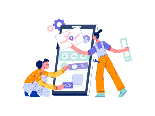
Did you know that there are approximately 275 million smartphone users in the United States alone? This represents a sizable pool of potential customers who may visit your website via mobile phones and tablets. Over half of adult smartphone users use their mobile devices to conduct a local search. As a result, if your site isn’t mobile-friendly, you’ll be losing traffic (and customers) from this important source.
That is why Google has recently introduced “Mobile-First Indexing.” This new algorithm prioritizes a website’s mobile version for indexing and search engine ranking. Because of mobile-first indexing, if a website is not optimized for mobile, it will have a more difficult time ranking on Google.
Not only that, but mobile-friendly sites are 5 times more likely to keep visitors interested due to fast page loads and intuitive design.
Find Information

Good navigation is an integral part of a great user experience. But the trick is to keep it as simple as possible. You have to let visitors easily find what they are or they should be looking for. It will most effectively help to convert. This is also essential for your SEO. The structure formation of your site influences how search engines understand it.
Solid internal linking between relevant pages keeps the users engaged on your site. Also, it helps the Bots (Google Bots) to understand where the majority of the traffic takes place. So, eventually, this increases the SEO value of the page you manage.
H1 Tag and Header Tags
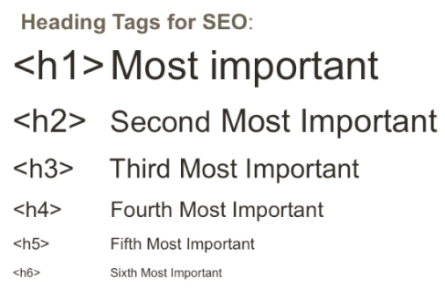
While headings are important for helping readers navigate your website’s content, they are also essential for good technical SEO. H1 tags inform search engine bots and website visitors about the contents of a page, so they must accurately summarize the contents.
Header tags (h1-h6) make content scanning much easier. It becomes clearer to search engines what topics and sub-topics are covered on a page. Headings help readers quickly identify the most important parts of the content by breaking up long text strings.
These factors tell Google how user-friendly your website is, which helps it rank higher. H-tags also make it easier for users with limited abilities to access and consume content on your site. In search engine rankings, accessibility is a significant factor.
404 Page
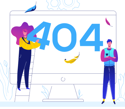
The presence of numerous broken links on the page is another website error that irritates customers. Broken links are pages that no longer exist and return 404 errors. If a visitor to your site clicks on a link and is redirected to a 404 error page, they will leave immediately and never return. Similarly, websites with a high number of 404 errors are less likely to rank highly in search results.
Favicon
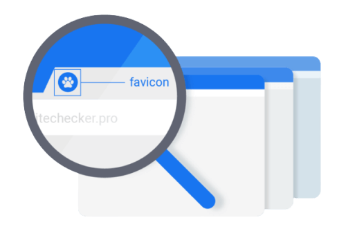
Favicon is another most crucial thing in web development. When you open multiple tabs on a browser, the icons you see are the symbols of that company. It comes along with the webpage’s title. Mostly they are logos from those companies. The title page is no longer visible when a user opens multiple tabs. It is the only mark that distinguishes one web page from the other.
So, if the Favicon is missing, users will be unable to identify your website. As a result, it will be hard for them to return. Finally, it can increase the bounce rate.
Disruptive Pop-Ups
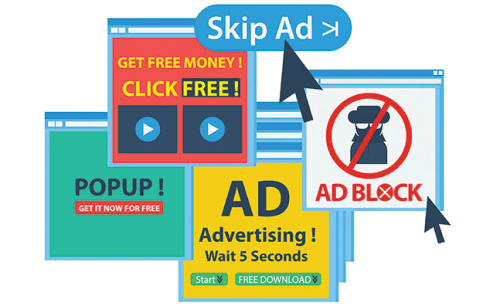
When you use pop-ups correctly, it can increase email subscribers by up to 1,375% percent. The issue arises when your pop-ups annoy and interrupt your visitors. Sites with annoying pop-ups, according to Google, will struggle to rank high in the SERPs. What is the solution? Create popups that your audience will enjoy.
They may never love them, so at the very least, create high-converting pop-ups that will not irritate them. You can, for example, schedule a pop-up to appear after a visitor has spent at least 30 seconds on your site. Alternatively, after a user has scrolled halfway down your page. Another thing you can do is make delectable pop-ups.
Alt Text In Images
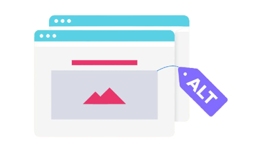
Setting alt text for images is critical for SEO and a key contributing factor in search engine rankings. As we’ve already mentioned. Alt tags give search engine crawlers context for what an image is showing. And, allowing them to properly index the image.
Infinite Scroll
Google’s Martin Spitt stated that Google Bots do not scroll through a site’s pages. So, if you implement a poor infinite scrolling system, this will affect your site’s SEO. As Google can not scroll through pages, it will index your site differently than you expect. It only indexes what is available on the display.
Bots will crawl that new content if the infinite scrolling increases the viewport. However, they will only do it once. It’s unlikely that you’ll be SEO-friendly if you have a lot of content that needs to load via infinite scrolling. Lastly, if you have a lot of content that requires ‘infinite scrolling’ to load, it’s probably not SEO-friendly.
Thin Content
Your website serves as your storefront. This means you should decorate it so that visitors are drawn to it and understand exactly what you have to offer. You should also optimize it for keywords so that people can find you. To ensure that you kill two birds with one stone? Avoid using thin content. Here are three indicators of stale content.
1. Having no Service/Product Pages means giving up the chance to rank for relevant keywords.
2. Having one keyword per page is a great idea. This means that each page will feature only one product or service. Make it simple for Google to understand the purpose of each of your web pages. You should be rewarded with increased SERP visibility.
3. When working on your product pages, don’t just scratch the surface. Fill them with a keyword-targeted, high-quality copy. Also, make sure the content you’re writing is compelling enough to convert visitors into paying customers.
Insufficient White Space

The area of the web page that it occupies is known as white space. To make all items visible and give consumers time to absorb all available information, there must be enough white space. White space allows the user to focus on each component without being distracted, improving readability and their focus on the main goal and services provided.
Inadequate Typography
Another common design mistake is the type of text style on the website. We call it typography. There are several factors that go into deciding the font style for a website. And, some of them you can find below.
- Make sure the font is readable. It should not be overly ornate or uninteresting.
- For font families, Serif and Sans-serif are very common. The font family used in headings and subordinate paragraphs should not be the same.
- The top two font styles are used on a sleek and modern website. Many font styles used on websites are clumsy and distracting.
Homepage With Carousels
Another common website design mistake to avoid is having carousels of slides that rotate automatically on the homepage. Moving carousels frustrate customers and direct you away from your conversion goals by diverting their attention away from the website’s core objective.
Wrapping Up
Finally, it seems like your search for all the common web design mistakes that hurt SEO has come to an end. Without SEO, it is impossible to imagine a successful website. A website needs a visually appealing design and SEO friendliness to ensure all the factors to attract and retain customers and convert them into loyal customers.
So, to achieve that, the web design team and SEO team should both work together. Without proper cooperation, it is not possible to make a website successful. A group of experienced designers, developers, SEO, and digital marketers can ensure that the final result is perfect, just as you wanted.
Thank you for your patience. ❤
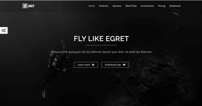
Hello, nice people! 🙋♂️ This is a gift from us to you. You can easily create a high-converting landing page with this free HTML5 template.
The Egret landing page is a one-page product landing page. You can use it as a portfolio or a landing page for a product. To make Egret we used HTML5, CSS3, and JQuery Animations. It has a responsive design and well-organized codes.
Key Features
- Multiple Colors
- Card Style
- Mail Chip Support
- Ajax Contact Form
- JQuery Animations
- Responsive Layout
You Might Also Like These Articles
- Convert TypeScript Project to JavaScript
- Top 15 Best Open Source React Chart Libraries
- Top 15 Free Best React Date Picker Components to use
- TypeScript & JavaScript – Which One to Choose?
- Best Free Tailwind CSS UI Kits and Components
- Web3 – The Decentralized Web of Future
- React Boilerplates You Should Not Miss
- 15 Nextjs Boilerplates You Need To Check Out
