Since the modern computer first launched, user interface design has evolved into a language of its own. So, here, we’ve gathered the 20 most common Macro-Level UI Design Terminologies for you. These UI design terminologies will assist you in staying updated with the latest design terms. Also, you’ll have better communication with your peers.
Octavia – Figma Dashboard & Design System
Macro-Level UI Design Terminologies
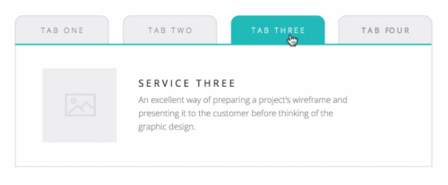
1. Tab
Tabs are a web design navigation element that allows users to easily access different areas of a site or different parts of a single page. They function similarly to tabbed dividers in a filing cabinet in that users can easily locate a page containing related content by clicking a tab.
2. Tab Bar
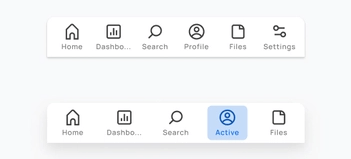
A Tab Bar is a navigation structure and the heart of your app’s functionality. It ensures users’ current location while providing a constant overview of all other pages or places. The tab bar organizes and allows navigation between related and at the same level of hierarchy groups of content. You can find the tab scroller and tab components in the tab bar.
3. Dropdown
The Dropdown design pattern displays a list of contents, navigation points, and functions. It is also known as a dropdown menu. It includes both the menu and its submenus. And from there, you can select a value from this series of options.

4. Card
A flexible-size container that organizes information and has the appearance of a playing card is called a Card. The card in UI designs has numerous benefits, but one of the most significant is how simple it is to recreate them in distinctive ways that will show a website’s personality.
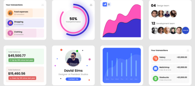
There are four kinds of cards that appear the most frequently among the many card types while examining the most popular and successful ones. These are Pins, Flat Design, Masonry, and Magazine Style.
5. To-do or To-do List App
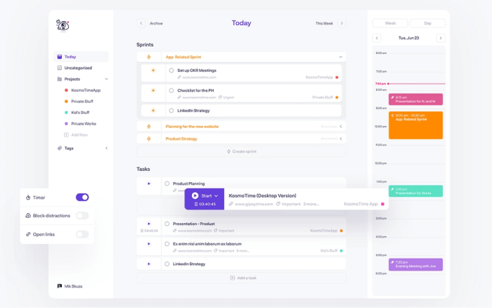
A To-do or To-do list App is an application for maintaining day-to-day tasks or listing work plans. You can ensure all your future tasks by making a To-do list. It records the tasks in one place. So, you don’t have to forget anything important for you to keep in mind.
6. Table
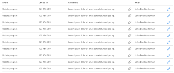
In UI design, a Table is for better visualizing data. It is to quickly scan, compare, sort, and filter the data to take their actions. In other words, tables are form elements that use columns and rows to display different interface information or data in a grid.
7. Pagination
The term Pagination is the process of splitting a pile of content. It divides a section of content from a web or app into different pages. In other words, pagination is a pattern in UI that separates tons of content into different pages. For example, at the bottom of a blog page, you can see a row of numbers (pagination) if there are a large number of blogs.

8. Progress Bar
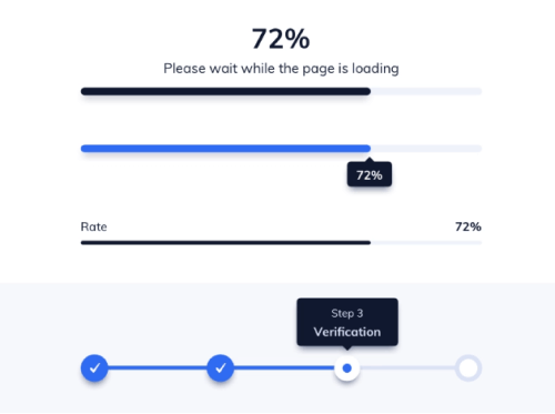
A Progress Bar is a graphical control element. It is for showing the progress of a computer operation. Download, file transfer, and installation are some examples of a progress bar. Also, it includes a textual representation with a visual of the progress in a percent format. In other words, a progress bar shows visual data and ensures that the app is progressing.
9. Navigation
A set of user interface controls provides Navigation for a website or product. Its purpose is to allow users to form a mental model of the structures that designers create. Users can easily navigate and rely on them. It is a UI layer with a set of controls that appears on top of the information architecture
10. Components
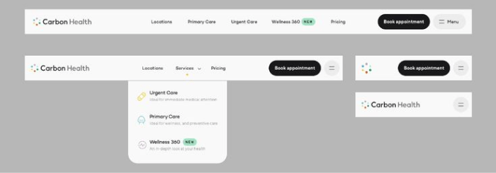
A Component is any part of your application that you can group logically and also think of as a single element. These are ideally reusable as a building block for the rest of the application. A component may contain other components within. However, each “component” is a separate entity.
11. Charts
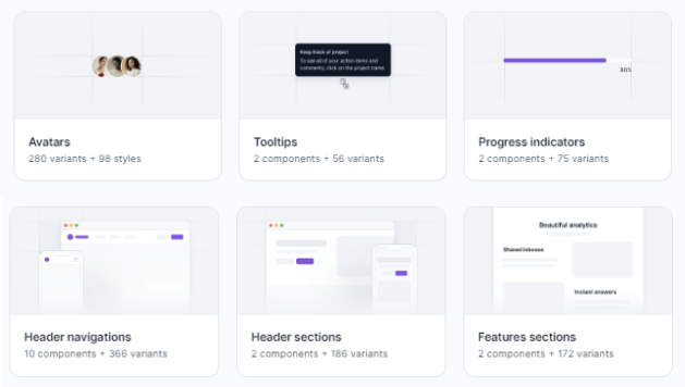
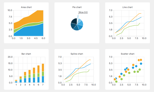
In UI design, Charts are visual representations of large amounts of data and the relationships between different parts of the data. They are more readable and understandable than raw data. There are various charts, such as bar charts, pie charts, line charts, column charts, bubble charts, and so on.
12. Breadcrumb
Breadcrumbs are a collection of links that represent the current page as well as its parent, grandparent page, and so on. It usually redirects to the site’s homepage. In other words, breadcrumbs are a secondary navigation aid that helps users quickly understand the relationship between their current location on a page and higher-level pages.

13. Carousel Slider
Carousel Slider is a photo and video slideshow on websites. It slides in motion, allowing users to navigate media files without wasting time or space. Although the carousel and slider have the same functionality, they have different approaches. A simple slider, for example, only shows one slide at a time, whereas a carousel shows multiple slides at once and highlights the media file you’re hovering over.
Example of a Carousel Slider:

Example of a Simple Slider:

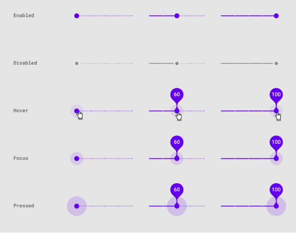
However, there is another type of Slider in UI design that enables users to increase or decrease the value or range from a fixed set of options. Here is an example.
14. Chatbot
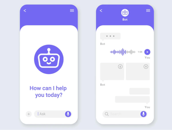
A Chatbot is a program in UI for interacting with users. It allows users to ask questions and interact using natural language (text, graphical elements, or voice messages). Chatbot provides real-time answers or solutions when a user wants to learn more about a business or ask a question.
15. Filtering
Filtering is a set of controls in user interface design. It allows you to select values to shortlist and specify your choice. There are a lot of different filter types and applying them depends on the purpose you’re using them for.

16. Comments
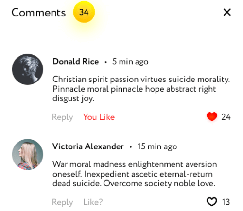
Comments increase both authors’ & users’ interactivity. If a product, video, audio, or text file (e.g. blogs) has a comments section, readers or viewers can share their thoughts on that particular subject or item.
17. Accordion
An Accordion in UI/UX design is a menu displaying a list of headers on top of one another. These headers reveal or hide content while clicking on them. You can navigate websites and pages using accordions. They can group links to assist users in navigating interfaces. These are especially useful in mobile design. It is because an accordion allows you to divide information into sections or pages. For example, most of the sites that have FAQs section come in accordion style.

18. Dialogs
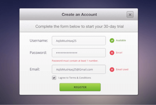
Dialogs are a combination of text and controls in UI design that inform users about various tasks and want you to take action, select, cancelation, or confirmation based on their requirements. When a dialog appears, it disables the rest of the app’s functionality and remains on the screen until you confirm, dismiss, or take action. Therefore, as a designer, you should only use dialogs when necessary.
19. Snackbars & Toasts
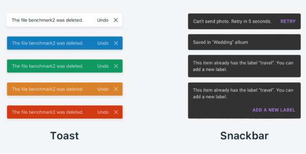
Snackbars are UI elements that notify the user of an action that an app has performed or will perform in the future. They might have a text action but no icons. Snackbars do not interfere with the user’s activity or experience. Toasts, on the other hand (Android only), are primarily for simple feedback or system messages. They disappear after a timeout and cannot be swiped away.
20. Metrics
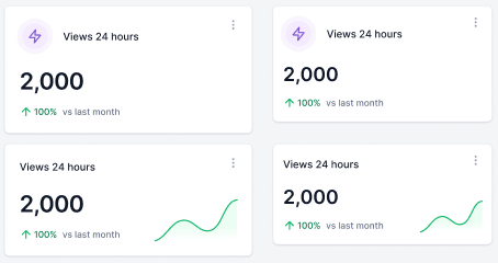
Metrics are indicators of whether or not your UX strategy is effective. It tracks changes over time benchmarks against previous iterations of your site or app, and can also display data from your competitors, compare, and help you set different goals.
Wrapping Up
Your search for Macro-Level UI Design Terminologies appears to have ended. However, these are not the only terms you will encounter while learning or practicing UI/UX Design. There are additional UI or UX design terminologies at the micro and macro levels.
Working as a UI/UX designer and learning the terms is akin to learning a new language. However, we believe that as you continue to learn more about UI and UX design, your vocabulary will grow. Use this term listicle for definitions and to quickly find the answer to a question until you become a UI/UX design expert.
We have gifts for you! Two awesome collections of Free & Premium Figma Dashboards, UI Kits & Design systems. Check out! 👇🥳
Similar Blogs
- 30+ Micro-Level UI Design Terms for UI/UX Designers
- UI Design Principles You Must Not Forget As A UI/UX Designer
- Best Free Figma Design Systems for UI/UX Designers
- Free Figma Wireframe Kits for Web/App Designers
- Best Free Figma UI Kits for Web App Designers
- Free Figma Icon Library for Web & App Developers
- Figma Plugins For Web & App Designers
