The vast industry of UI/UX design and development employs experts from many different backgrounds. While we learn the concepts best by doing the job. However, it is also very helpful to have references (beforehand) that compile key terms and definitions, so that we can easily clear any doubts. Therefore, this comprehensive list of 30+ Micro-Level UI Design Terms will help you understand the key technical terms. And, if you have a clear understanding of these terms, they will pillow your thought process in starting a design session, conversation, or in writing documentation.

Micro-Level UI Design Terms
1. Color Palette
Color Palette for UI designers specifically refers to a combination of colors for designing a User Interface. A color palette is a collection of colors or a visual foundation for your interface that has been chosen by the designer. It primarily represents the color formations of a brand.
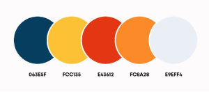
Also, it assists you in maintaining consistency throughout the design and bringing the brand’s aesthetics. This makes it easier for a designer to create visually appealing, pleasing, and enjoyable user experiences.
2. Color Code
Color Code primarily displays information about various colors in a way that a computer can understand and display. These are commonly used in UI design for websites and software applications. These come in various formats.

Currently, modern browsers support 24-bit color (full spectrum). And, guess what! There are over 10.6 million different color combinations available. Some of the most common color code types for UI designers are Hex, RGB, HSL, HSB, and CSS.
3. Typography
Typography in UI design refers to the art of assembling typefaces on an interface. Its goal is to make all copies meaningful to the audience, accessible, readable, legible, and scalable. In other words, typography makes it easier to understand information inside an interface. It enables users to realize how the product or service benefits them.

If the typography is appealing, it will help pique the user’s interest and increase the interface’s conversion rate. As a UI designer, you must understand typographic trends and approaches. Different typographic styles convey a variety of meanings. And, when it comes to UI design, it is best to keep things simple and clean.
4. Heading
Headings are names, titles, various terms, subdivisions, etc. The primary goal of headings is to “improve a page’s usability by making it more scannable.” Users typically scroll down the page looking for relevant keywords to further understand the topic step by step.
In this case, headings divide a page into sections to make a user’s scanning process faster and easier. Headings are also important for search engines to scan and understand the topic and figure out its relevance to the interface. In six sizes, headings are available: From H1 to H6. The H1 heading size is the highest and most important level of heading.
5. Body Height
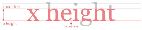
The Body Height in digital typography is the measurement from the top of the highest letterform to the bottom of the smallest.
6. Paragraph
The most fundamental unit of language that conveys meaning is the Paragraph. Though paragraphs are the core units of text content, designers frequently only specify the font face and size.
7. Form
Forms are a combination of inputs, selects, and text areas. Users who want to submit information fill out forms. One common example is when you order something online and fill out the form with different types of details like your address, quantity, etc. this is called a form.

The auto-filling feature in the form now made it easier for users to fill a form. Below we are going to describe to you what are inputs, selects, and text areas in short.
8. Input Fields

Users can enter various responses using Input Fields, which are crucial components of UI design. They come in a variety of contexts. However, most people have used them while providing personal information and shipping addresses on e-commerce website forms or while submitting online inquiries.
9. Selection
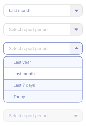
Selection is a group of elements on which user operations will be performed in UI design. Although the computer may make a choice automatically, the user often adds items to the list manually.
10. Textarea
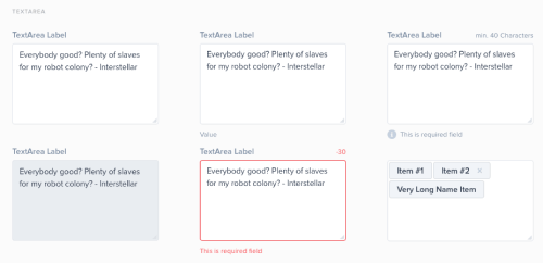
Textarea allows the user to enter and edit long text data displayed in multiple lines. The Text Area has a drag indicator that allows the user to resize the area horizontally and vertically.
11. Icons
Icons in UI design are pictograms or ideograms that are used in web or mobile interfaces to support usability and the successful flow of human-computer interaction.
These are an essential part of creating a visually appealing design, but they can also significantly improve the usability of a website or other digital product.
12. Buttons
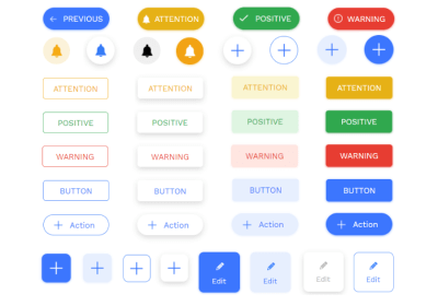
Buttons represent actions that users can take. They are typically placed throughout your website’s user interface, and they should be easily found and identifiable, as well as indicate the activities they allow a user to complete.
13. Button Groups
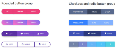
Button Groups are to create toolbars or split buttons for more complex components. These are also useful in UI for acting as mini “tabs,” such as switching between date ranges.
14. Badges
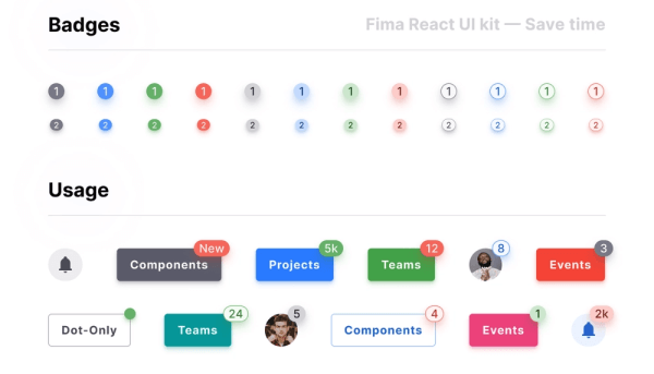
In user interface (UI) design, the term Badge refers to a particular symbol that highlights an interface element. Using badge notification is displayed. A badge adds more details to the component it is tied to.
15. Chips
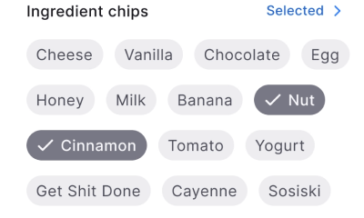
Chips in UI design are little elements that represent an input, an attribute, or an action.
16. Tags
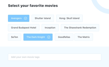
Tags enable users to quickly identify important information about items by organizing and categorizing them. They use keywords to visually label items with small amounts of information or the item’s status.
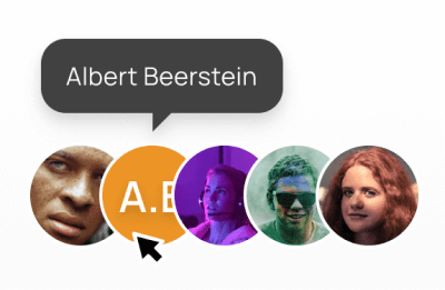
17. Avatar
An Avatar is a common UI element that represents users’ identities on the interface. You can see Avatars in business apps, social networks, and games. Even though it is a small object, it has amazing usability & importance: Avatars help people to connect in a more friendly way.
18. Rating
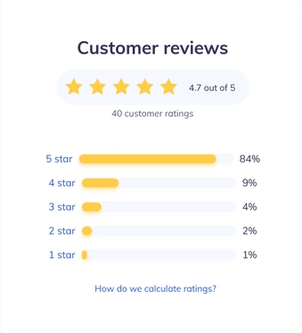
A Rating reflects a user’s interest in the content. Rating systems enable users to highlight the value or benefit of specific content and improve content quality over time in a continuous feedback loop. You can apply this characteristic to products with personalized attributes or without them.
19. Effects
The term Effects in design refers to shadows, elevations, and blurs. When we use a shadow, elevation, or blur in a UI component or element, we call it an effect.
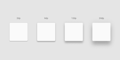
20. Drop Shadow
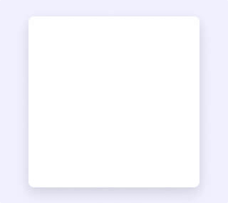
The term Drop Shadow is a shadow beneath an object. An object can be anything like an element, component, text, or image. When the color of the object and the background are too similar, a drop shadow can help to make it more visible and appealing. However, drop shadows must only be employed sparingly.
An amateur designer usually doesn’t know how to balance a drop shadow beneath objects. Also, in some cases, they put drop shadows even in irrelevant places.
21. Elevation
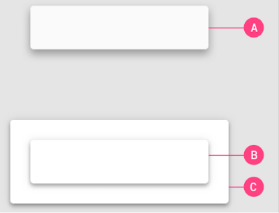
The Elevation is the z-axis distance or relative depth between two surfaces. The elevation of an element tells us how far apart the surfaces are and how deep the shadow is when measured from the front of one surface to the other.
22. Blur
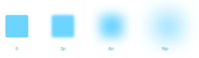
The term Blur refers to a visual effect when text or image edges appear fuzzy or out of focus. So, blurring is the process of making something less clear or distinct. In the context of image analysis, this could be interpreted broadly – anything that reduces or distorts the detail of an image could apply.
23. Toggle Switch & Toggle Button
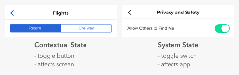
Toggles are user interface control with two mutually exclusive states: ON and OFF or Return and One Way. Designers frequently confuse toggle switches and toggle buttons because they both manage states, but there is a significant difference. Toggle switches represent system states, while toggle buttons represent contextual states.
24. Tooltip
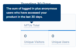
A Tooltip is a popular GUI element. It appears when we hover over an object. Its purpose is to display brief information about that element or component with a text box. An example would be a button’s description that explains what it is about, what an acronym stands for, and similar information.
25. Checkbox
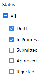
Checkboxes are little square boxes on a user interface. There are two possible states, one is checked and the other one is known as unchecked. The checkmark will appear in the square when it is checked. Utilizing checkboxes, the user is given a variety of options from which to choose as many as necessary to finish their work.
26. Radio Button

On the screen, the Radio Button appears as a little circle. Also, there are two button states, and when you select a button, a solid dot fills the circle. Unlike checkbox groups, radio button groups function as a single control and only allow the user to select one option from the available range.
27. Grid

Grid is a system for arranging layout when creating a responsive interface in UI design. The screen layouts are for websites, mobile apps, or other user interfaces. There are many grid types, and each one has a specific function.
By using rows and columns, the grid system helps in aligning page items. This column layout is used by designers to consistently place text, graphics, and functionalities throughout the design. Every component has a specific location we can easily recognize and duplicate elsewhere.
28. Gutter

The area between columns is known as Gutters. It helps in dividing content. At each breakpoint range, gutter widths are constant values. Gutter widths might vary at various breakpoints to suit a specific screen size.
29. Column Grid
This is the most common type of grid used by UI Designers. The term Column Grid involves taking a page and splitting it into several vertical fields, to which objects are then aligned. To make a complete page designers use column grids extensively.
30. Padding
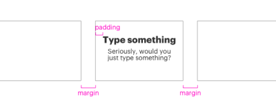
The spaces between UI elements are Paddings. Padding is an alternative spacing method to keylines. And you can measure it in 8dp or 4dp increments. You can measure padding both vertically and horizontally. To do that it does not have to span the entire height of a layout.
31. Margin
Margins are the spaces of a design that lies between the border and the element. These are all the empty spaces around the border and in between and other elements. A margin surrounds all four sides of the content, which you can change for each side.
32. Baseline Grid
For vertical spacing, a Baseline Grid is an excellent typographic tool. It can also be used to arrange other page elements. To put it another way, it aligns all of your text to a vertical grid, similar to lined papers.
Are These The End Of All Basic UI Design Terms?
It looks like your search for all micro-level UI design terms has ended. However, these are not the only terms that you’ll come across while learning or doing UI Design. There are more UI design terms both in terms of micro and macro levels. But these are the most common small UI design terms that designers always feel confused about at the beginning.
To work as a UI/UX designer and learn the terminology is similar to learning a new language. But, we believe as you will keep learning more about UI and UX design, your vocabulary will improve rapidly. Until you become a design expert, use this term listicle for definitions and quickly find the answer to a question.
Octavia – Figma Dashboard & Design System
Comments are closed, but trackbacks and pingbacks are open.