If you are a developer who wants to create a high converting landing page, you’re in the right place. Here, we will explain all the essential secrets to making a landing page that generates a high conversion rate.
Don’t get us wrong, we all adore visually appealing landing pages. The way the colors contrast to attract attention; the eye-catching custom photography and animation. Also, the elegant use of negative space and rule-of-three layouts. These things seriously keep us awake at night.
At UI-Lib, we understand that a landing page is more than just its appearance. We want a page that will not embarrass you when you show it to your Chief Marketing Officer (CMO). One with which you can, you know, build a campaign. What we want is a landing page that converts.
What Is a Landing Page?
A landing page is a single web page where a visitor first lands after clicking on a website’s link. It is created for marketing or advertising. A landing page can be your homepage or another page within your taxonomy. Whereas a web page can have multiple objectives, a landing page focuses on a single goal or objective. It is also referred to as a call to action (CTA). As a result, if it is a high converting landing page, it will aid in the growth of your business or marketing.
People frequently become perplexed when deciding between a landing page and a homepage or another page found through a search engine.
It all boils down to how they discovered your page and why it exists in the first place. People frequently discover homepages through social media. Whereas landing pages are frequently discovered organically, through the use of keywords and high-ranking search results.
A landing page is typically promoted using Google Adwords or another service of a similar nature. And it exists for only one reason: to convert. Again, if you set it up to increase conversions, this can be your homepage. There are numerous examples where a landing page can carry two goals in a single simple design.
We will get to all of these topics but before that let’s discuss all the benefits of having a good landing page.
Benefits of An Effective Landing Page
Aside from high conversion rates, effective landing pages have a few other advantages.
Promoting an Upcoming Product or Sale
When promoting an upcoming product or sale, emphasize one specific sale or marketing goal to increase conversion. It also allows you to isolate and track the success of a particular product, goal, or set of keywords.
Makes the Buying or Subscribing Process More Efficient
A high converting landing page simply serves as a conduit. It is for moving visitors further down the sales funnel. People find your CTA right away on the landing page, rather than stumbling across, and proceed to subscribe, sign up, buy, or join.
Getting SEO Ranking
A landing page is specifically designed to meet the targeted set of keywords. You can also promote them by using Google Adwords. Also, there are other boosting methods that you need to pay for. In both ways, you can achieve your product or business promotion. You can set up methods by which people who search for similar products will end up on your landing page or home page.
What Makes a High-Converting Landing Page?
Though we know that different people have different demands and tastes. So, it will be wrong to think that some equation will drag everyone on your site. However, it becomes clear over time that nearly all successful landing pages focused on some common elements. Those are our priorities.
Imagery
The primary image or video on your landing page is the first thing visitors will notice. So make it interesting. Show your product or service in action. Show how it works, and make it simple for people to imagine themselves reaping the benefits.
Call to action
Your primary conversion metric is your call to action (CTA). It is the one thing you want visitors to do on your page. Make sure your CTA is both visible and compelling. Both from the designer’s point of view and copy perspective. And, it will be best for you to remove any secondary links, including site navigation. Navigation that may cause someone to leave your page before converting through your CTA.
Value proposition, header, and subhead
Why should website visitors respond to your call to action? Use your headline and subheadline to clearly state the benefits of your offer and how you differ from your competitors.
Outline features and benefits
People must understand what your product or service does, but they are much more likely to convert if they understand the benefits they will receive if they follow through on your CTA. Benefits-oriented messaging (as demonstrated in some examples) is one of the most effective ways to increase conversions.
Testimonials, Social Proof
A business needs to showcase social proof from people who have already satisfied with that business’s products and services. if your new visitor sees that there are already people who visited the page, took products or services and they are satisfied with the company. It will give you a quick boost than those who do not showcase testimonials or any form of social proof.
Page Load Speed
Time is money, money is time. We’ve all heard the adage. This is also obviously true in this case. According to statistics, nearly 70% of consumers believe that page loading speed has a significant impact on their willingness to purchase a product. Furthermore, 46% of customers will never return to that slow-loading website because of their previous experience.
Ecommerce sites with the highest conversion rates fully load in less than two seconds. And, another statistic revealed that each additional second of loading time reduces a website’s conversion rate by 5%.
Mobile Responsive
Currently, mobile devices account for 46.54 percent of all web visits. As a result, it accounts for nearly half of all online website visitors. You can attract those visitors by ensuring that your website and landing page are completely mobile-friendly. Visitors will immediately leave your site if the landing page is not mobile-friendly.
Contact Information
Make sure your phone number and/or email button are in the header when optimizing your landing page. This could be a hassle for visitors to scroll down and look for your contact info. Within 2-3 seconds you have to grab your visitor’s attention. Otherwise, you will lose these leads. Another important aspect is your email should be in a button form. This way the bots cannot scrape the info and spam your inbox.
Incentive
From a psychological point of view, most of the time people feel comfortable giving something from their side when in return they get something. So, giving free useful stuff such as useful video tutorials, e-book, long guides, webinars, etc. is a great way for lead generation. In that way, you can easily ask for a visitor’s email address, and they will happily give that to you.
Guarantee
People do not want to spend dollars online on an unknown site for a product without quality assurance or a money-back guarantee. The legal security and the feeling that if anything goes wrong with the product we will at least get our money back or the company will pay for the return shipping gives us comfort. This secured feeling gives them the willingness to spend money on something online.
Therefore, always try to focus on removing the risk from the sale. It will surely improve the sales rate.
No Navigation Links
Always avoid using competing links and even internal links on your landing page. It will distract the customer from the goal. Keep focusing on a singular objective. If you need to put multiple objectives then wisely separate them.
Lack of distraction
You need to keep the landing page as simple as possible. It’s because people prefer to focus on a single goal at a single point in time. As a result, using too many elements may divert page visitors’ attention away from the call to action. As a result, you should concentrate on creating a clean page with contrasting colors for the background and buttons.
Also, avoid using unnecessary menus, sidebars, and so on. Also, keep the language simple; everyone should be able to understand what is being said. Keep it short and to the point.
Examples of High Converting Landing Pages
Here, we’ve gathered a few examples with hints about some of the most popular websites with high converting landing pages. By observing these examples you will get a basic idea of how to make one of these high converting landing pages. Though it is not that easy to make something like this. However, if you keep patience and focus on every aspect that we’ve discussed earlier, you can become a diamond.
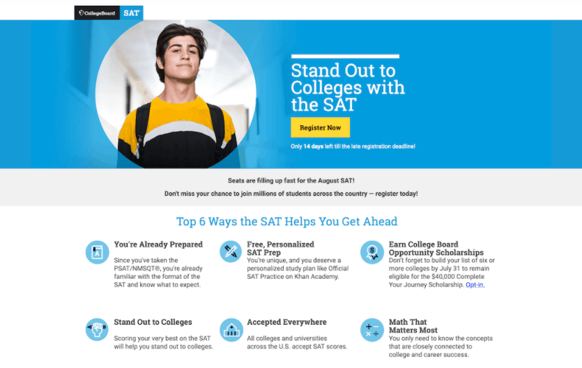
College Board – High Converitng Landing Page
Industry: Education
Conversion Rate: 77.38%
High-Converting Hint: Set an expiry date on your call to action.
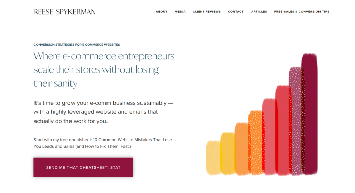
Design by Reese – High Converting Landing Page
Industry: eCommerce Business
Conversion Rate: 65.00%
High-Converting Hint: Focus on your targeted audiences’ current problems. Give a specific, highly leveraged free solution in return for their email address.
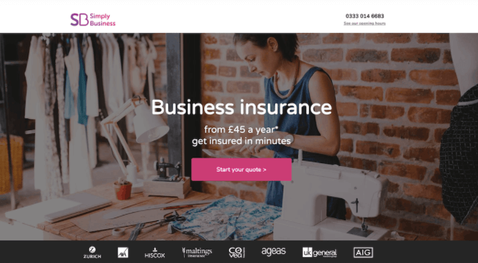
Simply Business – High Converting landing Page
Industry: Insurance
Conversion Rate: 62.26%
High-Converting Hint: Present complicated products in an uncomplicated way.
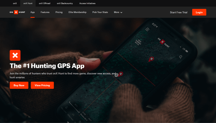
onX – High Converting Landing Page
Industry: Navigation
Conversion Rate: 61.15%
High-Converting Hint: Match visitor search intent in written and visual content.
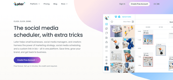
Later – High Converting Landing Page
Industry: Social Media
Conversion Rate: 57.92%
High-Converting Hint: Maintain conversion scent and balance your incentives.
Summing Up
According to the findings, on average, only five to ten people from a hundred convert into leads. So, if you’re still creating boring landing pages with confusing messages. You should take a pause and rethink the issue. This process will help you to save a lot of your working time, effort, and money.
Please keep in mind, you need to put in the effort to understand the details, concepts, and tricks of creating a great landing page and then apply them to your design. Test your designs through these parameters that we have covered earlier and keep updating your landing page with time, trend and demand. Thank you!
Hey good people! 🙋♂️ Here’s a present from us to you. 👇 With this free HTML5 template, you can easily create a high-converting landing page. 🤩
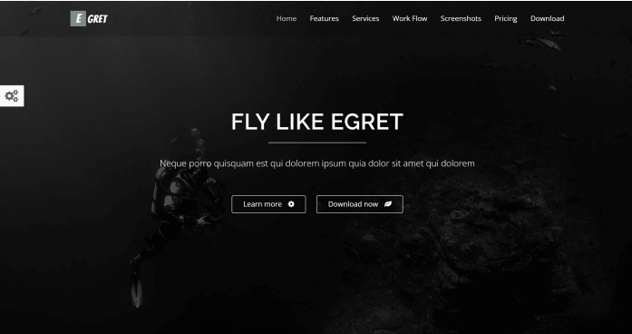
Egret is a product landing page that is only one page long. It can also be used as a portfolio or a product landing page. Egret was created using HTML5, CSS3, and JQuery Animations. It has a responsive design and well-organized code.
Key Features
- Multiple Colors
- Card Style
- Mail Chip Support
- Ajax Contact Form
- JQuery Animations
- Responsive Layout
You Might Also Like These Articles
- Convert TypeScript Project to JavaScript
- Top 15 Best Open Source React Chart Libraries for 2021
- Top 15 Free Best React Date Picker Components to use in 2021
- TypeScript & JavaScript – Which One to Choose in 2021?
- Best Free Tailwind CSS UI Kits and Components in 2022
- Web3 – The Decentralized Web of Future
- Why & How to Get Started with Open-Source Software?
- React Boilerplates You Should Not Miss
- 15 Nextjs Boilerplates You Need To Check Out


Comments are closed, but trackbacks and pingbacks are open.