
Tables are common in web applications. As there are so many free table libraries available, creating and styling a Reactjs table manually is not necessary. So, we’ve carefully chosen a list of the top ReactJS table libraries. We’ll go through all the benefits and drawbacks of each library. Also, we will learn all the installation processes and examples.
As React has such a large ecosystem, there are numerous third-party reactjs table libraries. So, let us look at some of the best Reactjs Table Libraries.
1. Material Table – Reactjs Table
In a React application, the material table is a powerful way to represent data in a table format. Moreover, the elements are styled by Material UI guidelines. It is one of the most popular open-source libraries in the React space and offers a variety of individual components. Depending on the complexity, we can use these components to tackle the styling. This library’s most recent version requires a minimum React version of 16.8.5.
Install the library in a React app from a terminal window and run the following commands to see it in action:
yarn add material-table @material-ui/core
Then include Material Icons. There are two approaches to this. The first method is to simply import the Material Icons font into the file using HTML. public/index.html:
<link
  rel="stylesheet"
  href="https://fonts.googleapis.com/icon?family=Material+Icons"
/>
Alternatively, you can install the @material-ui/icons package in the React app:
yarn add @material-ui/icons
The data provided to a React app in a real-world application comes from an external API. Inside the src/ directory, create a new file called data.js and add the following code snippet:
export const data = [
  {
    id: 1,
    title: 'The Hunger Games',
    authors: 'Suzanne Collins',
    num_pages: 374,
    rating: 4.33
  },
  {
    id: 2,
    title: 'Harry Potter and the Order of the Phoenix',
    authors: 'J.K. Rowling',
    num_pages: 870,
    rating: 4.48
  },
  {
    id: 3,
    title: 'To Kill a Mockingbird',
    authors: 'Harper Lee',
    num_pages: 324,
    rating: 4.27
  },
  {
    id: 4,
    title: 'Pride and Prejudice',
    authors: 'Jane Austen',
    num_pages: 279,
    rating: 4.25
  },
  {
    id: 5,
    title: 'Twilight',
    authors: 'Stephenie Meyer',
    num_pages: 498,
    rating: 3.58
  },
  {
    id: 6,
    title: 'The Book Thief',
    authors: 'Markus Zusak',
    num_pages: 552,
    rating: 4.36
  }
];
Then create a new file called MTable.js and import the material-table library and the array of dummy data:
import MaterialTable from 'material-table';
import { data } from '../data';
Since material-table is a React component, you can define a custom component like this:
const MTable = () => {
  //...
};
export default MTable;
The material-table library anticipates receiving two props. The prop data is used to display the data in a row format. The number of columns is defined by another prop columns . It is an array that expects the title of each column as the heading of the specific column and the original field:
const columns = [
  { title: 'Title', field: 'title' },
  { title: 'Author', field: 'authors' },
  { title: 'Page Count', field: 'num_pages' },
  { title: 'Rating', field: 'rating' }
];
A third prop on the<MaterialTable /> a component called title can be used to give the table a title as shown below:
return (
  <div style={{ maxWidth: '100%' }}>
    <MaterialTable columns={columns} data={data} title='Books Directory' />
  </div>
);
To see it in action, import the custom table component in the App.js file:
import MTable from './components/MTable';
function App() {
  return (
    <div style={{ padding: '30px' }}>
      <h1>Material Table Example</h1>
      <MTable />
    </div>
  );
}
export default App;
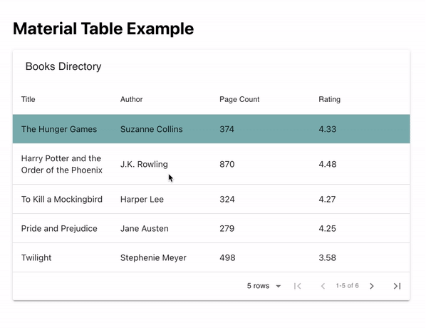
By default, the material-table library displays a search bar and pagination.

You can customize the view of the table by adding a fourth prop called options that is an object and is used to customize the table.
Add the following prop to <MaterialTable/>:
import { useState } from 'react';
import MaterialTable from 'material-table';
import { data } from '../data';
const MTable = () => {
  const [selectedRow, setSelectedRow] = useState(null);
  const columns = [
    { title: 'Title', field: 'title' },
    { title: 'Author', field: 'authors' },
    { title: 'Page Count', field: 'num_pages' },
    { title: 'Rating', field: 'rating' }
  ];
  return (
    <div style={{ maxWidth: '100%' }}>
      <MaterialTable
        columns={columns}
        data={data}
        title='Books Directory'
        onRowClick={(evt, selectedRow) =>
          setSelectedRow(selectedRow.tableData.id)
        }
        options={{
          search: false,
          rowStyle: rowData => ({
            backgroundColor:
              selectedRow === rowData.tableData.id ? '#67aeae' : '#FFF'
          })
        }}
      />
    </div>
  );
};
export default MTable;
Here is the output:
2. React Bootstrap Table2
If you’re using Bootstrap-based UI components in your React app, react-react-bootstrap-table2 is a perfect match for displaying data tables and using the same design system. It has a cleaner design and a smaller bundle size, which eliminates the need to handle too much business logic.
To install it in a React app, run the following command from a terminal window:
yarn add react-bootstrap-table-next
Then, import the Bootstrap CSS library into the React app. This is usually done inside the App.js or index.js file:
import 'react-bootstrap-table-next/dist/react-bootstrap-table2.min.css';
Then, create a custom component file called BTable.js and import the component BootstrapTable from the react-bootstrap-table-next library.
import BootstrapTable from 'react-bootstrap-table-next';
import { data } from '../data';
Each data array field you want to display as an object is here as an array. The value of dataField reflects the actual field from the data array, while the text in each object represents the custom header name of each column:
const BTable = () => {
  const columns = [
    { text: 'Title', dataField: 'title' },
    { text: 'Author', dataField: 'authors' },
    { text: 'Page Count', dataField: 'num_pages' },
    { text: 'Rating', dataField: 'rating' }
  ];
  return (
    <div style={{ maxWidth: '100%' }}>
      <BootstrapTable columns={columns} data={data} keyField='id' />
    </div>
  );
};
export default BTable;
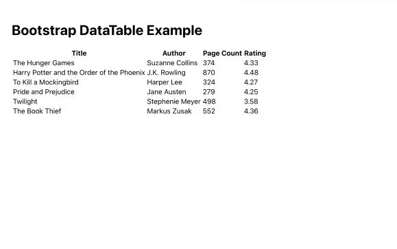
Here is a basic table output:
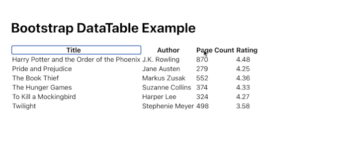
There are two methods for creating custom settings. The first is to provide fundamental capabilities such as sorting data in columns here, in this manner:
const columns = [
  { text: 'Title', dataField: 'title', sort: true },
  { text: 'Author', dataField: 'authors' },
  { text: 'Page Count', dataField: 'num_pages' },
  { text: 'Rating', dataField: 'rating', sort: true }
];
In the preceding code snippet, we add a third property sort with a boolean value of true to the data fields title and rating. This enables sorting in these two columns based on ascending and descending values.
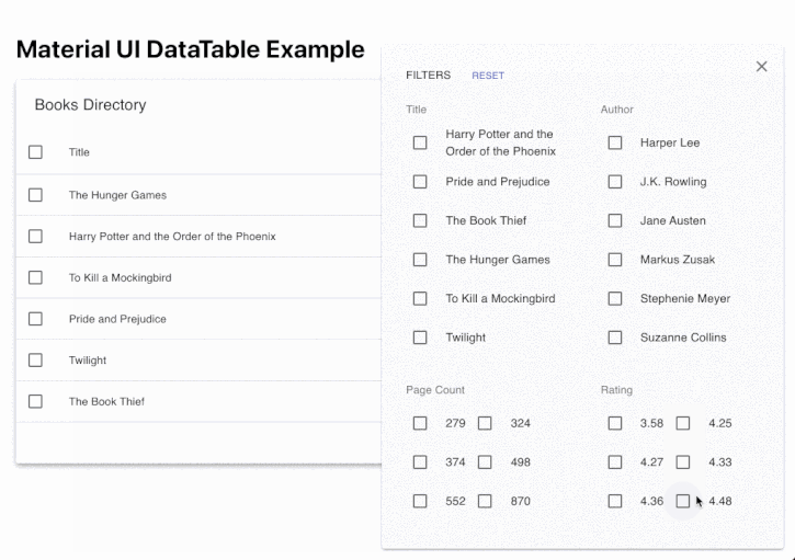
3. MUI Datatables
This list includes yet another Material UI-based data table component. If you’re using a Material UI-based design system in your React project, MUI-Datatables is a great way to represent data tables. Filtering, row selection, searching, exporting to CSV format, sorting, and other features are available.
To see it in action, install it in a React project first:
yarn add mui-datatables @material-ui/core @material-ui/icons
Then, in MUITable.js, create a custom component file and import the component frommui-datatables. Let’s use the same dummy data set to display the data inside the table component, so import it from thesrc/data.jsfile as well:
import MUIDataTable from 'mui-datatables';
import { data } from '../data';
columns are here as an array, and each field from the data array that you want to display as an object is here as an object. Each object’s label represents the column’s custom header name:
const MUITable = () => {
  const columns = [
    { label: 'Title', name: 'title' },
    { label: 'Author', name: 'authors' },
    { label: 'Page Count', name: 'num_pages', options: { sort: true } },
    { label: 'Rating', name: 'rating' }
  ];
  const options = {
    filterType: 'checkbox'
  };
  return (
    <div style={{ maxWidth: '100%' }}>
      <MUIDataTable
        columns={columns}
        data={data}
        title='Books Directory'
        options={options}
      />
    </div>
  );
};
export default MUITable;
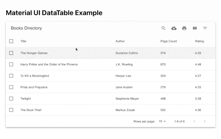
Other features such as searching, hiding a specific column, and filtering a value are also here.
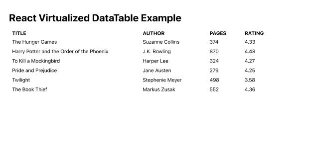
4. react virtualized – Reactjs Table
This is now a multi-purpose component library that supports large lists and tables of data. It supports simple table forms as well as grid, masonry, list, and collection formats for data tables. Because it supports a variety of formats and dynamic data lists, it is one of the most popular open-source component libraries on this list.
Install it in a React app by running the following command from a terminal window:
yarn add react-virtualized
Now you have to import react-virtualized/styles.css:
import { Column, Table } from 'react-virtualized';
import 'react-virtualized/styles.css';
import { data } from '../data';
The Column component shows each component. It accepts a label prop that projects the header title of the column. The dataKey prop represents the field in the data array and a custom value for width for each column:
const RVTable = () => {
  return (
    <div style={{ maxWidth: '100%' }}>
      <Table
        headerHeight={20}
        width={920}
        height={300}
        rowHeight={30}
        rowGetter={({ index }) => data[index]}
        rowCount={data.length}
      >
        <Column label='Title' dataKey='title' width={400} />
        <Column label='Author' dataKey='authors' width={200} />
        <Column label='Pages' dataKey='num_pages' width={100} />
        <Column label='Rating' dataKey='rating' width={100} />
      </Table>
    </div>
  );
};
export default RVTable;
Here is the output:
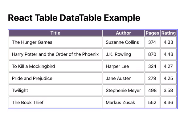
5. React Table – Reactjs Table
React Table is a small package that allows you to display data in a table format. It is a utility library rather than a table component library, as are the other libraries on this list.
To see it in action, first install it in a terminal window by typing the following command:
yarn add react-table
Then, name your custom component file RTTable.js. Because it supports React hooks, import the hook useTable from the the react-table library.
import BootstrapTable from 'react-bootstrap-table-next';
import { data } from '../data';
To define the structure of the columns of the table, add the following:
const RTTable = () => {
  const columns = [
    {
      Header: 'Title',
      accessor: 'title'
    },
    {
      Header: 'Author',
      accessor: 'authors'
    },
    {
      Header: 'Pages',
      accessor: 'num_pages'
    },
    {
      Header: 'Rating',
      accessor: 'rating'
    }
  ];
  //...
};
export default RTTable;
The accessor property has the same value as the key in the data array. To ensure that the array of data is recreated on every render, React Table library recommends the use of the useMemo hook.
import { useMemo } from 'react';
import { useTable } from 'react-table';
import { data as mockData } from '../data';
const RTTable = () => {
  const data = useMemo(() => mockData, []);
  const columns = useMemo(
    () => [
      {
        Header: 'Title',
        accessor: 'title'
      },
      {
        Header: 'Author',
        accessor: 'authors'
      },
      {
        Header: 'Pages',
        accessor: 'num_pages'
      },
      {
        Header: 'Rating',
        accessor: 'rating'
      }
    ],
    []
  );
  // ...
};
Only when the memoized value is changed does React Table calculate the columns based on the data provided. After defining the columns and data array, pass them as arguments to the useTable hook to create a table instance.
const tableInstance = useTable({ columns, data });
const {
  getTableProps,
  getTableBodyProps,
  headerGroups,
  rows,
  prepareRow
} = tableInstance;
return (
  <table {...getTableProps()} style={{ border: 'solid 1px blue' }}>
    <thead>
      {headerGroups.map(headerGroup => (
        <tr {...headerGroup.getHeaderGroupProps()}>
          {headerGroup.headers.map(column => (
            <th
              {...column.getHeaderProps()}
              style={{
                background: '#657',
                color: 'white',
                fontWeight: 'bold'
              }}
            >
              {column.render('Header')}
            </th>
          ))}
        </tr>
      ))}
    </thead>
    <tbody {...getTableBodyProps()}>
      {rows.map(row => {
        prepareRow(row);
        return (
          <tr {...row.getRowProps()}>
            {row.cells.map(cell => {
              return (
                <td
                  {...cell.getCellProps()}
                  style={{
                    padding: '10px',
                    border: 'solid 0.6px gray',
                    background: '#fff'
                  }}
                >
                  {cell.render('Cell')}
                </td>
              );
            })}
          </tr>
        );
      })}
    </tbody>
  </table>
);
Here is the output for the above basic example:
GitHub Official Documentation Examples
A Bonus React Table Library – Awesome React Tables 👌🥳

GitHub Official Documentation Examples
Wrapping Up
These component libraries’ purpose is to provide a good development experience while allowing you to represent data in a table. Because of the development costs, some of the integrations these libraries provide are difficult to establish from scratch. Therefore, we’ve gone over all of the steps you’ll need to take to put them into action. With these items, we conclude this blog post on Best React Table Libraries.
Thank you for reading.
Comments are closed, but trackbacks and pingbacks are open.