Do you want to employ the best React Date Picker components in your next project? You’ve come to the right place. They’re right down the road! I’ve carefully chosen the top 15 free best React Date Pickers for React Projects in this blog post. But first, let’s take a quick look at what React Date Picker is all about.
React Datepicker
A date picker, also known as a popup calendar, date and time picker, or time picker, is a graphical user interface widget that allows the user to choose a date from a calendar and/or a time from a time range. Thus, React datepicker components also do the same job. React Datepicker components are a particular kind of User Interface components that are based on React.js.
These simple reusable components have become the most popular libraries for React.
Note: Before selecting a Date Picker for your project, please carefully review the demonstrations, specifications, and requirements. It is best to go through Github repositories for a detailed inspection. Different types of work are supported by different React datepickers. So, double-check that the prerequisites fully match your system or, if necessary, install them first.
What Is So Great About React Datepickers?
The finest datepicker components are React Datepicker components. These points demonstrate why.
- Users can set or choose the date with just a mouse.
- Eliminates the need to write down the date.
- Excellent Community Support.
- Blazingly Fast.
- Reusable components.
- Simple & modern Looking.
- Easy to Set Up.
- Light Weight.
and a lot of other aspects that make React.js Datepicker components one of the best.
Best React Date Picker Components
Note: The list below is in no particular order.
1. Wojtekmaj / React Date Picker
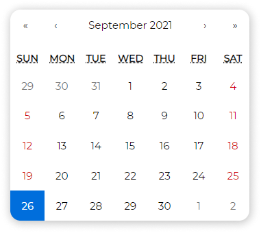
Main Features
- Date Picker
- Time Picker
- DateTime Range Picker
- Time Range Picker
- Date Range Picker
- DateTime Picker
- Calendar
- Clock
- Customizable
- Lightweight Library
Installation Command
npm install react-date-picker --save
Code Snippet
import React, { useState } from 'react';
import DatePicker from 'react-date-picker';

export default function MyDatePicker() {
  const [value, updateValue] = useState(new Date());

  const onChange = (date) => {
    updateValue(date);
  }

  return (
    <div>
      <DatePicker
        onChange={onChange}
        value={value}
      />
    </div>
  );
}
2. React day picker
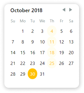
Main Features
- Simple Library
- Easy to customize
- Localizable
- extensive list of examples
- Native TypeScript Support
- Date Picker
- ARIA Support
Installation Command
npm install react-day-picker --save
Code Snippet
import React, { useState } from "react";
import DayPickerInput from "react-day-picker/DayPickerInput";
import "react-day-picker/lib/style.css";

export default function ReactDayPicker() {
  const [date, setDate] = useState(new Date());

  function onChange(date) {
    setDate(date);
  }

  return <DayPickerInput onDayChange={onChange} />;
}
3. Material UI Date/Time Picker
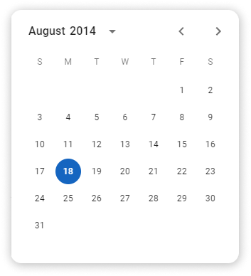
Main Features
- Follows Material UI Design
- Supports 4 different date library ( date-fns, Day.js, Luxon, Moment.js)
- DatePicker
- Time Picker
- DateTime Picker
- Date Range Picker
- Localizable
Installation Command
Core Material UI Library:
npm install @material-ui/core date-fns @date-io/date-fns@^1.3.13 @material-ui/pickers --save
Code Snippet
import React, { useState } from 'react';
import DateFnsUtils from '@date-io/date-fns';
import {
  MuiPickersUtilsProvider,
  KeyboardDatePicker,
} from '@material-ui/pickers';

export default function MaterialDatePicker() {

  const [selectedDate, setSelectedDate] = useState(new Date());

  const handleDateChange = (date) => {
    setSelectedDate(date);
  };

  return (
    <MuiPickersUtilsProvider utils={DateFnsUtils}>
      <KeyboardDatePicker
        disableToolbar
        variant="inline"
        format="MM/dd/yyyy"
        margin="normal"
        id="date-picker-inline"
        label="Date picker inline"
        value={selectedDate}
        onChange={handleDateChange}
        KeyboardButtonProps={{
          'aria-label': 'change date',
        }}
      />
    </MuiPickersUtilsProvider>
  );

}
4. Carbon Design System DatePicker
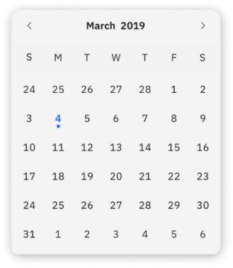
Main Features
- Date Picker
- IBM’s Open-Source Design System
- Supports React, Vue, Angular, Svelte, Vanilla JS
- Fully Customizable by using flatpickr options.
- Easy to Use
Installation Command
npm install carbon-components carbon-components-react carbon-icons --save
Code Snippet
import React from 'react';
import { DatePickerInput } from 'carbon-components-react';

export default function CarbonDatePicker() {

  return (
    <DatePickerInput
        placeholder="mm/dd/yyyy"
        labelText="Date Picker label"
        id="date-picker-single"
        onChange={date => {
          console.log(date);
        }}
      />
    </DatePicker>
  );
}
5. Airbnb React Dates
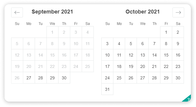
Main Features
- Mobile Friendly
- Localizable
- Date Picker
- date Range Picker
Installation Command
npm install react-dates --save
Code Snippet
import React, { useState } from "react";
import "react-dates/initialize";
import "react-dates/lib/css/_datepicker.css";
import { SingleDatePicker } from "react-dates";

export default function ReactdatesDatepicker() {
  const [date, setDate] = useState(null);
  const [isFocused, setIsFocused] = useState(false);

  function onDateChange(date) {
    setDate(date);
  }

  function onFocusChange({ focused }) {
    setIsFocused(focused);
  }

  return (
    <SingleDatePicker
      id="date_input"
      date={date}
      focused={isFocused}
      onDateChange={onDateChange}
      onFocusChange={onFocusChange}
    />
  );
}
6. React Datepicker
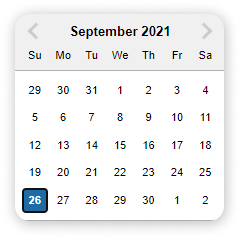
Main Features
- Reusable
- Easy to Use
- Simple Design
- date-fns for localization
- Date Picker
Installation Command
npm install react-datepicker --save
Code Snippet
import React, { useState } from "react";
import DatePicker from "react-datepicker";
import "react-datepicker/dist/react-datepicker.css";

export default function HackeroneDatepicker() {
  const [date, setDate] = useState(new Date());

  function onChange(date) {
    setDate(date);
  }

  return <DatePicker selected={date} onChange={onChange} />;
}
7. React Rainbow Components Date Picker
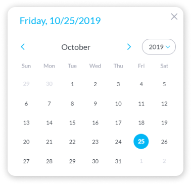
Note: React Rainbow is a UI component library. You have to adopt the whole library to use it.
Main Features
- Date Picker
- DateTime Picker
- Date Picker Modal
- Simple Design
- Supports Dark Mode
- Customizable
Installation Command
npm install react-rainbow-components --save
Code Snippet
import React, { useState } from "react";
import { DatePicker } from "react-rainbow-components";

export default function RainbowDatepicker() {
  const [date, setDate] = useState(null);

  function onChange(date) {
    setDate(date);
  }

  return (
    <DatePicker
      id="datePicker-1"
      value={date}
      onChange={onChange}
      label="DatePicker Label"
      formatStyle="large"
    />
  );
}
8. Ant Design DatePicker
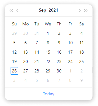
Main Features
- Date Picker
- TIme Picker
- DateTime Picker
- Date Range Picker
- Provides a UI Component Library
- Localizable
- TypeScript Support
- Customizable
- Follows Ant Design Specification
- Smple Design
- Better User Experience
Installation Command
npm install antd --save
Code Snippet
import React, { useState } from "react";
import { DatePicker } from "antd";
import "antd/dist/antd.css";

export default function AntDatepicker() {
  const [date, setDate] = useState(new Date());

  function onChange(date, dateString) {
    setDate(date);
  }

  return <DatePicker onChange={onChange} />;
}
9. Hypeserver / React Date Range
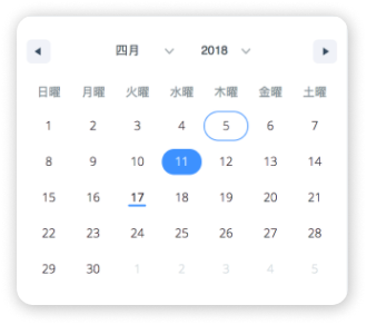
Main Features
- Calendar Input
- Date Range Picker
- Highly Customizable
- Click & Hold Selection
Installation Command
npm install react-date-range date-fns --save
Code Snippet
import React, { useState } from "react";
import { Calendar } from "react-date-range";
import "react-date-range/dist/styles.css";
import "react-date-range/dist/theme/default.css";

export default function HypeserverDatepicker() {
  const [date, setDate] = useState(new Date());

  function onChange(date) {
    setDate(date);
  }

  return <Calendar date={date} onChange={onChange} />;
}
10. RC Datepicker
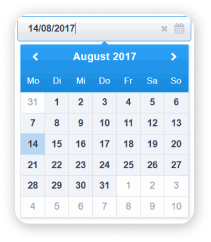
Main Features
- Decent Design
- DatePicker
- Easy to Set Up
- Customizable
Installation Command
npm install --save rc-datepicker
Code Snippet
import React from 'react';

// Import Datepicker
import { DatePicker, DatePickerInput } from 'rc-datepicker';

// Import the default style
import 'rc-datepicker/lib/style.css';

export default class App extends React.Component {
    constructor(props, context) {
        super(props, context);

        // Initial state with date
        this.state = {
            // or Date or Moment.js
            selectedDate: '2017-08-13'
        };

        // This binding is necessary to make `this` work in the callback
        this.onChange = this.onChange.bind(this);
    }

    onChange(date) {
		this.setState({
			selectedDate: date
		});
	}

    render() {
        return (
            <div>
                <DatePickerInput
                    onChange={this.onChange}
                    value={this.state.selectedDate}
                    className='my-custom-datepicker-component'
                />

                {/* this renders only a fixed datepicker */}
                <DatePicker onChange={this.onChange} value={this.state.selectedDate} />
            </div>
        );
    }
}
11. React Datepicker CS
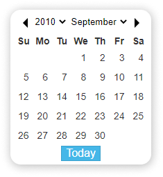
Main Features
- Siplified DatePicker
- Simple Installation
- Multi-Language Support
- Only Have 5 Properties
Installation Command
npm install react-date-picker-cs --save
Code Snippet
import React from 'react';

// Import Datepicker
import ReactDatePicker from 'react-date-picker-cs';

export default class App extends React.Component {
    constructor(props, context) {
        super(props, context);

        // Initial state with date
        this.state = {
            selectedDate: '2017-08-13'
        };

        // This binding is necessary to make `this` work in the callback
        this.handleLog = this.handleLog.bind(this);
    }

    handleLog(date) {
		this.setState({
			selectedDate: date
		});
	}

    render() {
        return (
            <div>
                <ReactDatePicker
                    onChange={this.handleLog}
                    range={[2013, 2020]}
                    value={this.state.selectedDate}
                    disabled={true}
                />
            </div>
        );
    }
}
12. Input Moment
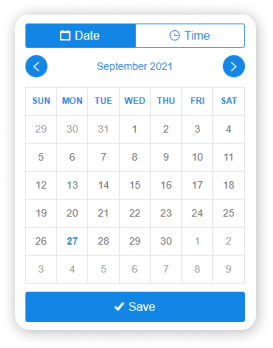
Note: This module requires Moment.js as a peerDependency.
Main Features
- DateTime Picker
- Icons from Ionicons
- Powered by Moment.js
- ISC License
- Easy to Install
Installation Command
npm i input-moment --save
Code Snippet
import '../src/less/input-moment.less';
import './app.less';
import moment from 'moment';
import React, { Component } from 'react';
import ReactDOM from 'react-dom';
import InputMoment from '../src/input-moment';
import packageJson from '../package.json';

class App extends Component {
  state = {
    m: moment()
  };

  handleChange = m => {
    this.setState({ m });
  };

  handleSave = () => {
    console.log('saved', this.state.m.format('llll'));
  };

  render() {
    return (
      <div className="app">
        <h1>
          {packageJson.name}: {packageJson.version}
        </h1>
        <h2>{packageJson.description}</h2>
        <form>
          <div className="input">
            <input type="text" value={this.state.m.format('llll')} readOnly />
          </div>
          <InputMoment
            moment={this.state.m}
            onChange={this.handleChange}
            minStep={5}
            onSave={this.handleSave}
          />
        </form>
      </div>
    );
  }
}
13. React Bootstrap Datepicker
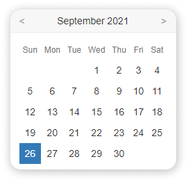
Note: For this one, you have to import the Bootstrap theme.
Main Features
- Bootstrap based
- Minimal Design
- Date Picker
- Customizable
Installation Command
npm install react-bootstrap-date-picker
Code Snippet
import React from 'react';

// Import Datepicker
import DatePicker from "react-bootstrap-date-picker";

// Import Bootstrap components
import FormGroup from 'react-bootstrap/lib/FormGroup';
import ControlLabel from 'react-bootstrap/lib/ControlLabel';
import HelpBlock from 'react-bootstrap/lib/HelpBlock';

export default class App extends React.Component {
    constructor(props, context) {
        super(props, context);

        // Initial state with date
        this.state = {
            selectedDate: new Date().toISOString()
        };

        // This binding is necessary to make `this` work in the callback
        this.onChange = this.onChange.bind(this);
    }

    onChange(value, formattedValue) {
		this.setState({
            value: value, // ISO String, ex: "2016-11-19T12:00:00.000Z"
            formattedValue: formattedValue // Formatted String, ex: "11/19/2016"
        });
	}

    componentDidUpdate() {
        // Access ISO String and formatted values from the DOM.
        var hiddenInputElement = document.getElementById("example-datepicker");
        console.log(hiddenInputElement.value); // ISO String, ex: "2016-11-19T12:00:00.000Z"
        console.log(hiddenInputElement.getAttribute('data-formattedvalue')) // Formatted String, ex: "11/19/2016"
    }

    render() {
        return (
            <div>
                <FormGroup>
                    <ControlLabel>Label</ControlLabel>
                    <DatePicker id="example-datepicker" value={this.state.selectedDate} onChange={this.onChange} />
                    <HelpBlock>Help</HelpBlock>
                </FormGroup>
            </div>
        );
    }
}
13. React Infinite Calendar
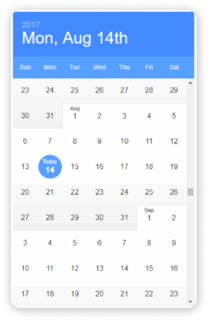
Main Features
- Infinite Scrolling
- Flexiblity
- Localizable
- Customizable
- Date Picker
- Extensible
- Mobile-Friendly
- keyboard Support
- Events and Call Back
- Themes
Installation Command
npm install react-infinite-calendar --save
Usage
import React from 'react';
import { render } from 'react-dom';
import InfiniteCalendar from 'react-infinite-calendar';
import 'react-infinite-calendar/styles.css'; // only needs to be imported once

// Render the Calendar
var today = new Date();
var lastWeek = new Date(today.getFullYear(), today.getMonth(), today.getDate() - 7);

render(
  <InfiniteCalendar
    width={400}
    height={600}
    selected={today}
    disabledDays={[0,6]}
    minDate={lastWeek}
  />,
  document.getElementById('root')
);
15. React Input Calendar
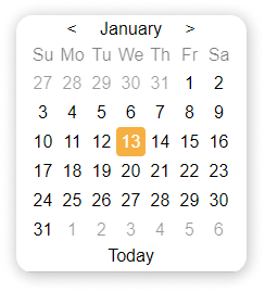
Main Features
- Simple Component
- All Systems written in CSS
- Date Input Calendar
- Minimal Design
- Easy to Install
Installation Command
npm install react-input-calendar
Usage
import Calendar from 'react-input-calendar'
<Calendar format='DD/MM/YYYY' date='4-12-2014' />
Conclusion
Finally, it appears that your quest for the finest Vue datepicker has come to an end. Choosing amongst these free React.js date pickers is a challenging challenge. However, if you keep to your criteria, you should be able to quickly narrow down 3 to 4 date pickers that would work best for your project. So, do a thorough examination of these datepicker components and achieve a positive user experience. Thank you for being with us, and we wish you all the best.
About Us
We provide high-quality free and premium templates, UI kits, and design systems for customers and developers at UI-Lib. React, Angular, Vue, HTML, and other technologies are used to do this. We place a premium on high quality, extensive expertise, and optimism. On Themeforest, we now have over 9000 sales.
You can also find the best Vue Datepicker components here.


Comments are closed, but trackbacks and pingbacks are open.